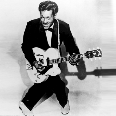
260115 – Rock – Conduit St, London > words
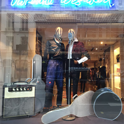
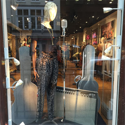
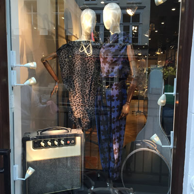
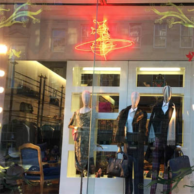
The first window for Spring with a Rock n Roll inspired set of props as seen in the accessories catalogue shoot.
The first window for Spring with a Rock n Roll inspired set of props as seen in the accessories catalogue shoot.

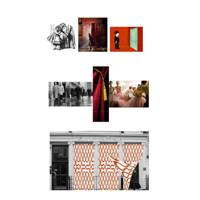
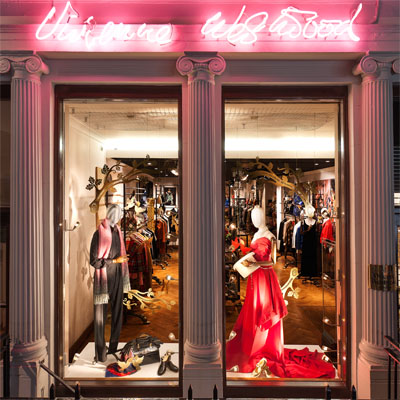
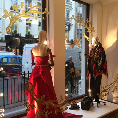
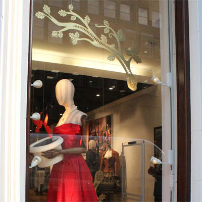
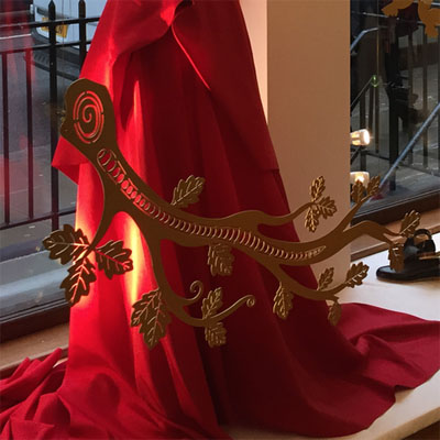
The inspiration for the Christmas window came from the special packaging produced for the season. Taking the red pair of doves used in the Gold Label collection I searched postcards from Victorian times that had used these and took a filigree element that could then be simplified and used to create a frame for each window. The doves were then suspended amongst the mannequins with a special red pair that referenced the collection. The window works three dimensionally and can be equally viewed from inside and outside the store. For the roll out of London stores the Christmas idea was simplified as a decal for the glass as shown here in Newcastle.
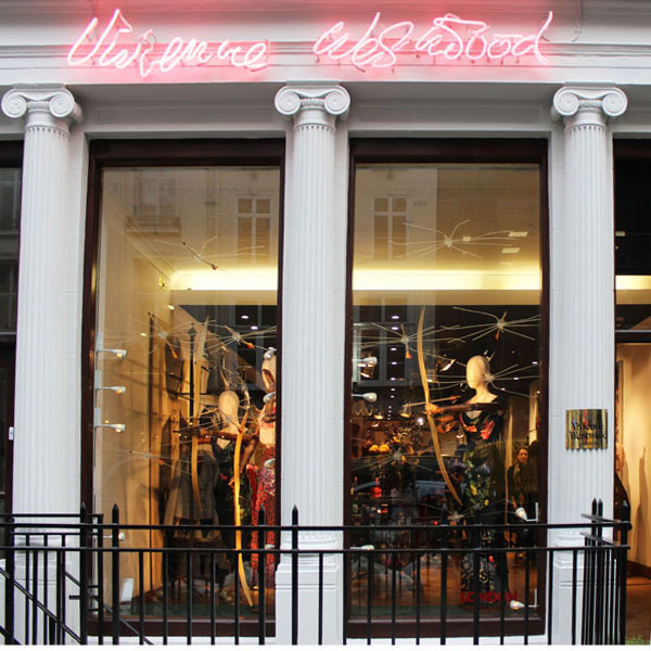
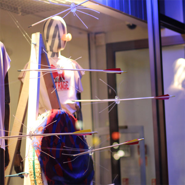
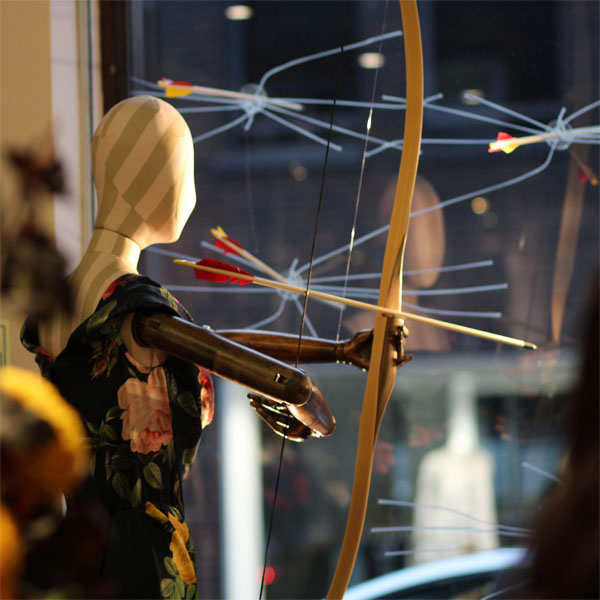

A one-day installation. The Vivienne Westwood Man and Woman stores face each other on either side of Conduit street. Here the mannequins fire arrows through the store front at each other linking both stores for Vogue Fashion Night Out.
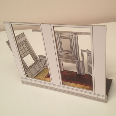
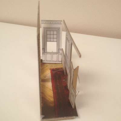
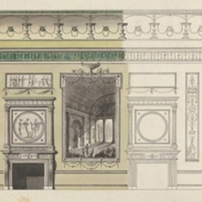
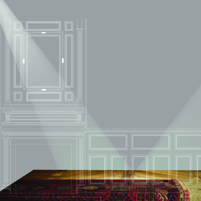
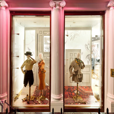
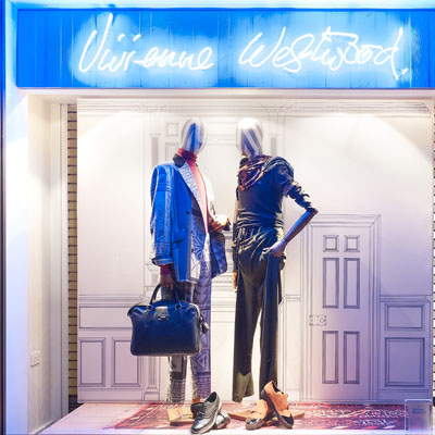
Using inspiration from the current campaign imagery by Juergen Teller, which was taken in Vivienne’s Georgian home a simple architectural elevation of a Georgian room was printed onto canvas and stretched around a frame to create a backdrop for the mannequins. At Davies Street the same elevation was printed onto a clear vinyl and applied to the glass, along with a printed rug floor design.
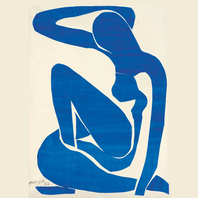

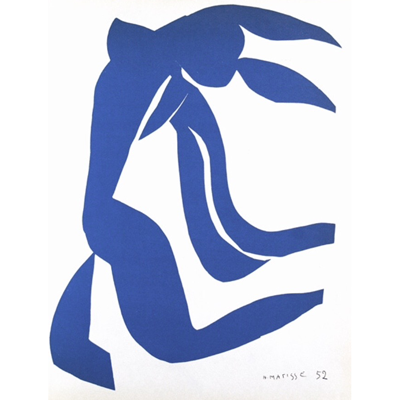

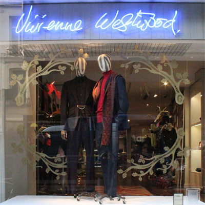
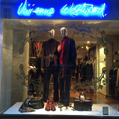
A Matisse cut out had been one of the concept generators for the SS15 collection. Taking the idea of the Matisse cut outs and relating them to pattern cut outs evolved into a window installation of overlaying shapes. This is at once recognisable as a form and upon closer inspection identifiable as individual elements.
After the initial overview undertaken through store visits a report has been presented to the company.
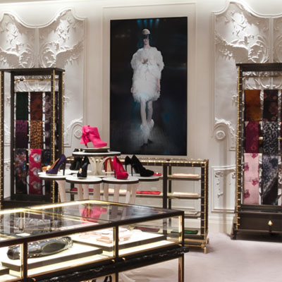
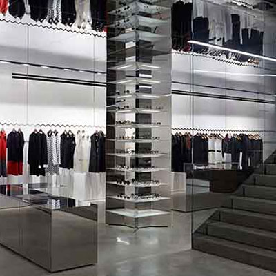
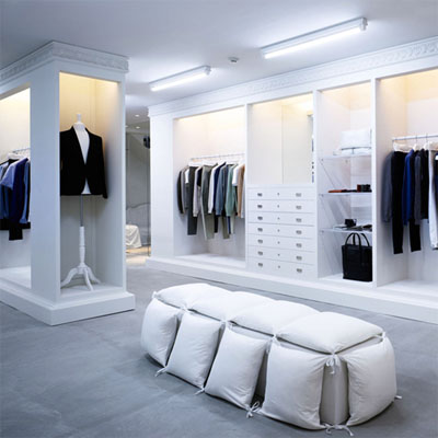
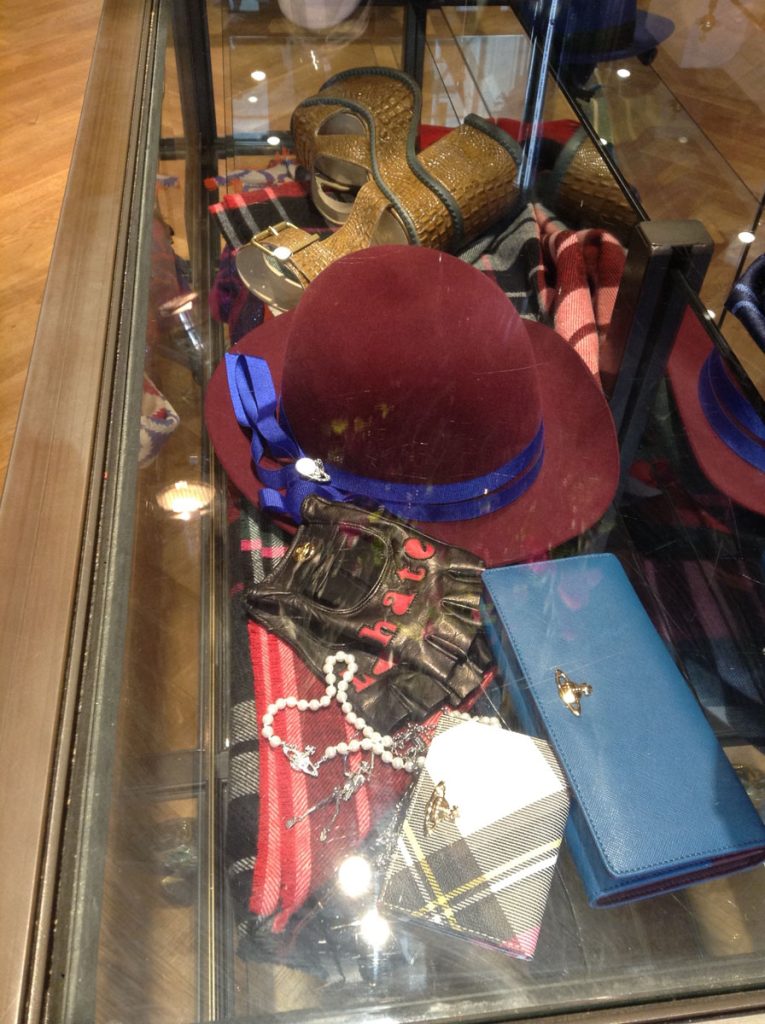
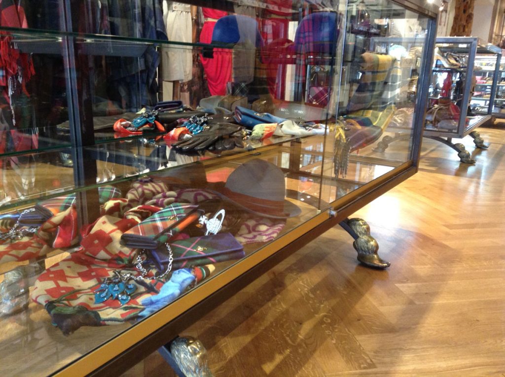
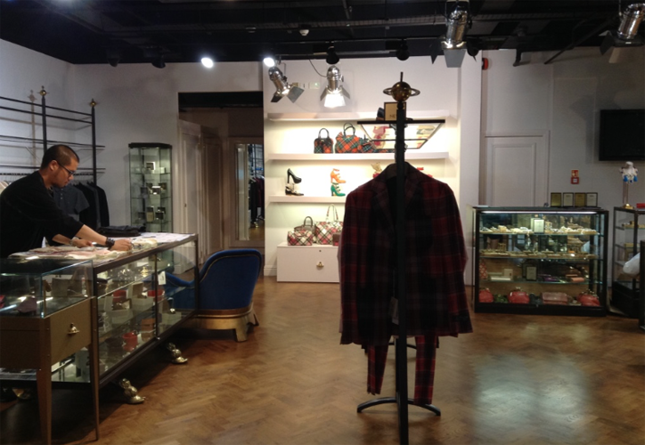
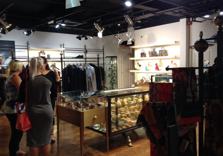
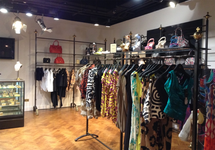
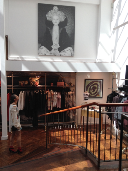
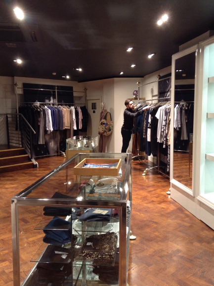
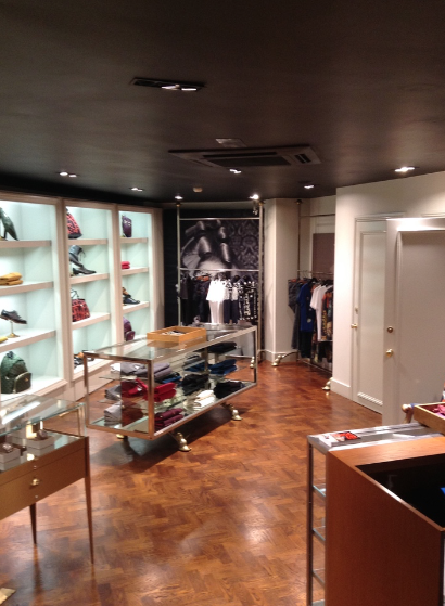
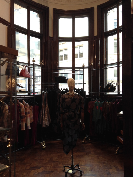
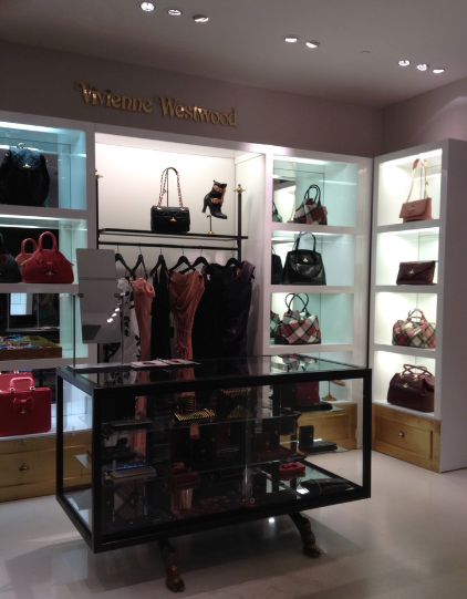
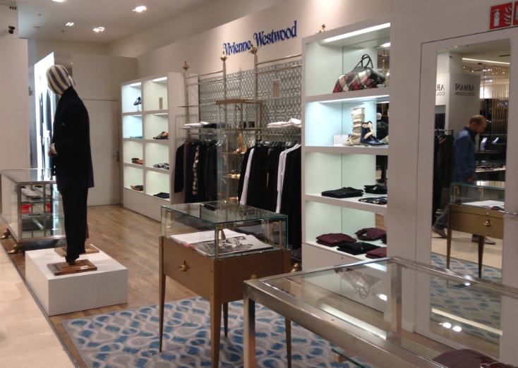
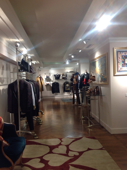
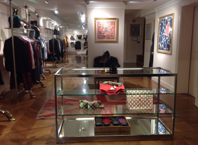
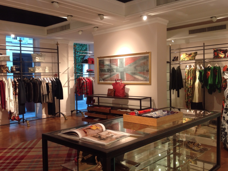
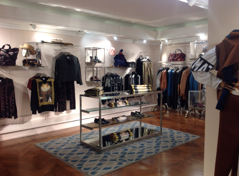
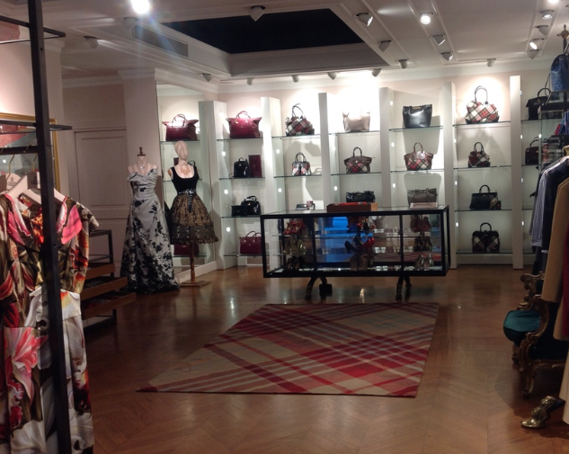
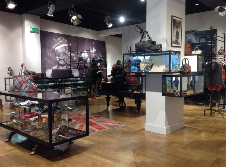
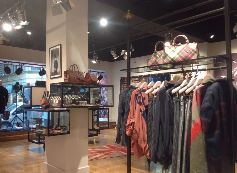
Key areas for consideration will be the volume of stock on display in each store. This must be reduced in order for the quality of the brand to gain more in-store presence. The grouping of the collections and the styling of the collections represented must be significantly raised, in order to realise the creative nature of the brand and push the brand personality further. This must be consistent across all stores. The impact of the report on stock on display and its influence on both sales and the spatial experience is noticeable immediately.
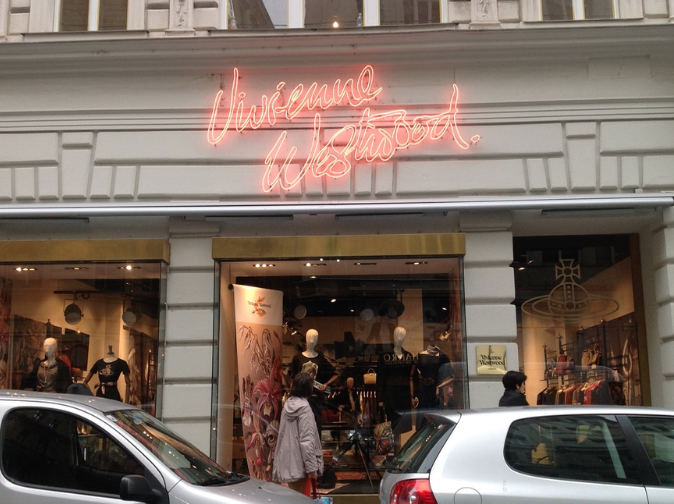
So this is what I start with. In the first two months I visit every UK and European Vivienne Westwood Store to see where potential changes need to be made. There are a number of questions that need to be addressed:
The answer to these questions will help develop a strategy on how to move forwards and to best deliver the conclusions.
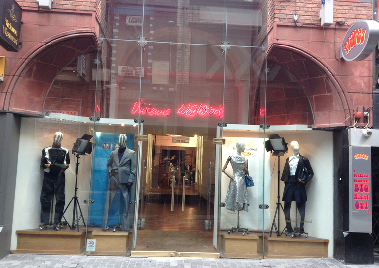
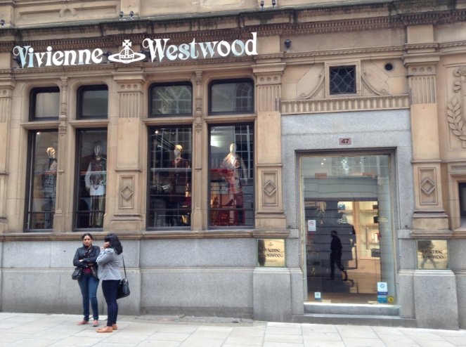
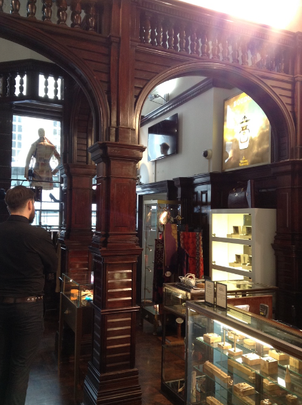
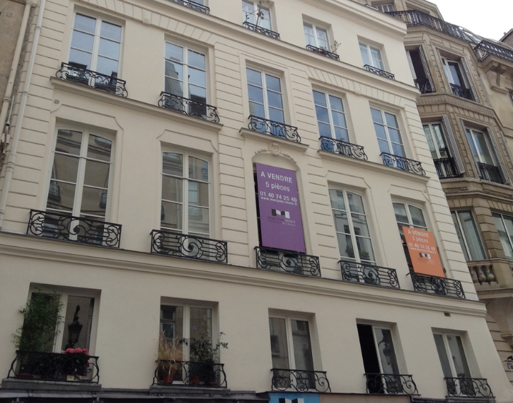
It is clear that the problems are not just aesthetic. Stores are inconsistent in type, character, age and context. Spaces are used as found with furniture inserted as need requires there is very little design overview. With a new store concept starting to be worked on, the initial changes need to be relevant to this transition, and final roll out. One problem is the locations of the stores. Vivienne Westwood bought back the Northern Stores from Hervia and ran with the leases that were already in place, some of these stores are outside of the main shopping areas, in particular Liverpool. This is something that should be addressed as it affects both passing trade and our ability to build brand awareness. The main focus has to be on the product and ensuring this is displayed in the best way to engage customers and tell the Vivienne Westwood story. Rather than having everything out on the shop floor I am proposing a reduction in the amounts we display and make this generic across all the stores.
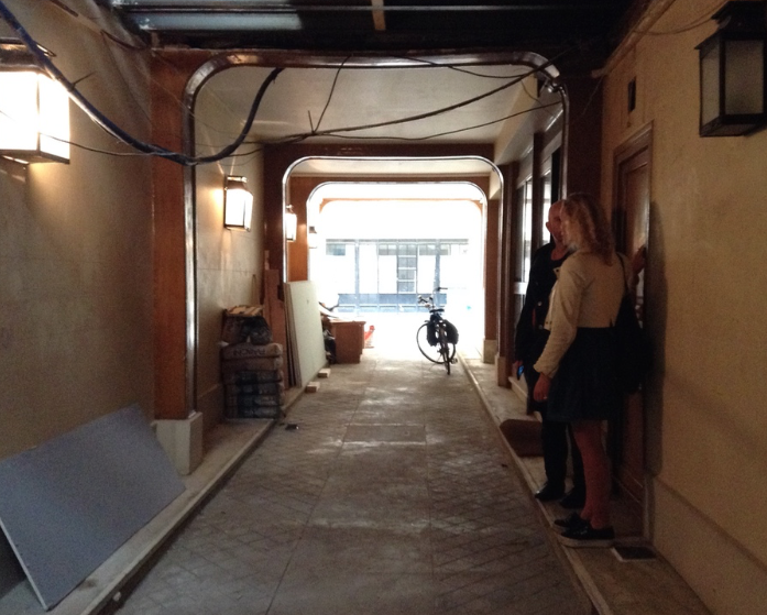
It is 23 June 2014 and the first day as Visual Merchandising Manager for Vivienne Westwood.