
230822 Yohji Yamamoto > words
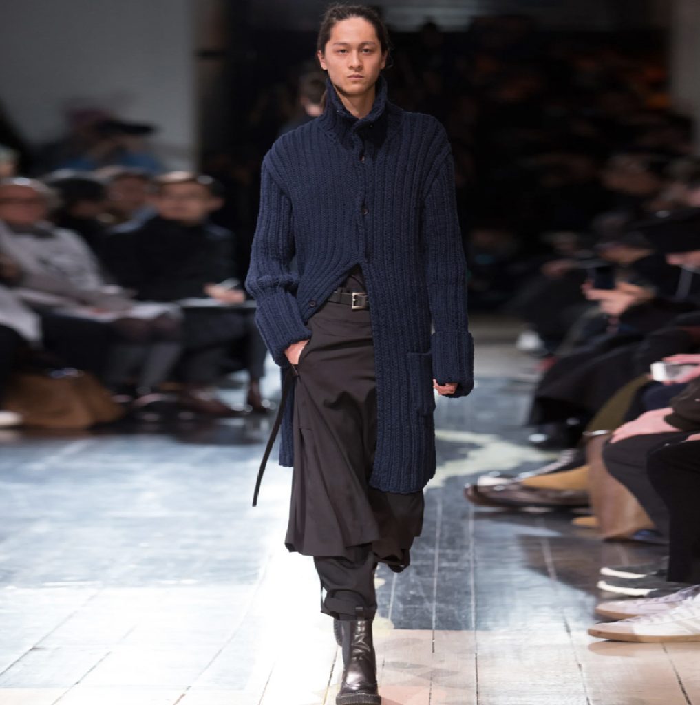
The ability for a textile to incorporate time, ageing, wear, and use all of these to enhance the garment throughout its history gives each item its exclusivity and longevity. Dyes fade over numerous washes, or bleach out under sunlight chronicling the wearer’s usage, each fold records its own rate or usage and through this exposure each garment reveals its own time map. This ageless quality of Yohji Yamamoto’s clothes along with the black aesthetic became the designer’s uniform throughout the 1990’s. With time the black aesthetic became less important and the ageless and more subtle qualities of Yohji’s clothes became more endearing. Ageless and classic are often the same term within design vocabulary.
Yohji Yamamoto’s interest in textiles is the basis of much of his work, within his designs he can give them strength and fragility to form. Whether a garment is hemmed or not hemmed, allowed to fall on the bias or is gathered and tied, the textile embodies the wearer and is imprinted over time through use, unique to the wearer. The textile in this way does not wear out or become redundant but instead becomes enriched and personalised. The clothes are styled in such a way that they evade fashion and seek to avoid the disposable churn incorporated into the two shows per season ethos. It is possible to wear an early 1990’s Yohji garment with a contemporary piece of today 2022 without it either looking out of place or dated.
It needs to be remembered that when Yohji made his Paris debut in 1981, Paris was still promoting the “Jolie Madame’ candy-coloured expensive outfits, designed to be the envy of other women and pleasing to men. Yamamoto’s show, a parade of marching women, often shaven headed, in dark, distressed, asymmetric, oversized outfits confronted this preconception. Those that wore Yamamoto were labelled ‘the crows’. Paris was forced to reassess it’s preconceptions of female beauty. Yohji describes Winter as his favourite season and that he is a coat designer, “coats represent the house, protection” you can live inside protected. Yamamoto dresses women in men’s clothes, to create coats for protection. To protect women in men’s coats, empower the working independent woman. Soon after, in 1984, Yamamoto introduced his men’s collections to Paris with a similar aesthetic, not only were these pieces gender neutral, but many items were also interchangeable across the collections women’s to men’s. Yamamoto wanted his clothes to envelope a person’s body as opposed to exposing it. He describes the desire to design clothes that protect, hiding the body, protecting it from the elements, protecting it visually, this he says is about sexuality, gender protection. Yamamoto also wished to protect the clothes from fashion. His clothes are designed for long life, ten years or more, they are clothes designed to be outside of the fashion world or the perpetual transience of fashion. Yamamoto saw fashion design as too busy, fiddled with, appliqued, whereas longevity required simplicity and simplicity requires purity or essence.
The ‘Jolie Madame’ clothes of the eighties which were fitted, Yohji’s garments rarely fit or are fitted, hanging slightly oversize incorporating a space between the garment and the body allowing the wearer to inhabit the garment naturally. The garments are not tailored to the point that they dictate the way one sits, walks or stands and as such are not tailored for that moment, that fad, that season. They fall in soft folds, can be layered and as such absorb the texture of woollens, rough cloth, cottons, working together to create a timeless look of the chique vagabond. This volume, the space between garment and wearer animates movement, as the garments are rarely static, the recurring fall of soft fold over fold, a daily choreography, the unseen performance. The non-fit or non-fitted avoids gender stereotypes, it is gender neutral, non-ageist, non-sexist, androgenous. In 1998 Yamamoto presented an entire Menswear Collection on women, in 2004 a menswear collection with each male model skirted. Menswear and women’s wear collections consisting of garments, large loose-fitting garments, often asymmetrically constructed with minimal decoration, regularly with unfinished seams and nearly always predominantly black can be interchanged, traded between male and female.
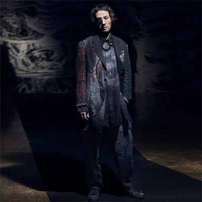
Yamamoto’s clothes are often asymmetrical. Asymmetry falls within the broader philosophy of perfection and imperfection, unfinished. Like an artist’s sketch that allows the viewer to complete the composition, here the wearer completes the look by adding their personality. Symmetry, what the eye expects to perceive, is too easy, too ordered whereas asymmetry enhances the fall of a moving garment, a garment where space between the wearer and the clothing allow for movement. Clothes are never still, never perfect as drawn or as worn on the mannequin. One can imagine a symmetrical front, a symmetrical back but how often is anyone viewed perfectly square on, most of the time we are at three quarters view and moving, a composition which explores the rhythm of that movement not the static idealised perfection of symmetry. Asymmetry with sleeves of different lengths, pockets orphaned, panels opposed in both length, cut and volume enhance this continually changing moving composition. There is a romanticism to the clothing and a reference to the period of Romanticism. The clothes draw from the past yet embrace the degradation of the contemporary, their conclusion a timeless artifact outside of the seasonal à la mode procedures and practices, with gender-ambiguous clothing and reconstructions of historical western dress. As a musician or a dancer that continually practices scales or steps, Yohji has been described as a master tailor but he is this only in his ability to understand full traditional clothes and then to deconstruct and reconstruct them for the contemporary urban world. He understands that the same clothes worn on the catwalk by a model become knowingly reconfigured when worn by the customer, the designer no longer controls either their look or their composition. The loose fit, asymmetrical folded compositions, multiple layered items allow for endless re-composition controlled by the inherent theme of the quixotic itinerant gypsy. From his first men’s collection in 1984, Yamamoto had an objective to be the outsider of men’s suits, the outsider of the businessman, the desire to design for the urban vagabond. Within this parameter, material comes to life with time, making its mark over the years as it wears and frays, folds and creases, slowly incorporating the imprint of the wearer bearing the traces of a rich past. To encourage this Yamamoto can often manipulates his materials, crushing, boiling, fraying, cutting, crumpling, tearing or stretching it, so that it looks worked, lived in. Simple woollens, cottons, canvas, workwear fabrics, these are the materials that can absorb time. The unstitched pinstripe suit with hanging cotton threads seen also as a theme in the collections of Vivienne Westwood’s. Yamamoto’s clothes can get dirty, they can wear out and with that they barely age this only adds to the aesthetic.
Like all individuals practising outside what is expected this can create tensions between business and the business of design. Yohji’s company filed for bankruptcy in 2009 and was taken over by Japan’s Integral Corporation. We live in a world dominated by corporations and conglomerates, and these have their use as now Yohji can concentrate on design and the Integral Corporation can concentrate on the business side. The design prerequisite is not to lose control over direction, even as the market by necessity may need to grow and incorporate other branded items. For example, Yohji Homme, the first men’s fragrance a mixture of cardamom, bergamot, cedar wood, leather, patchouli with a glaze of coffee was aimed at the nomadic spirit, the explorer, the adventurer, that lies dormant within every man. The fragrance references the clothes, an unchained freedom, not tied to an office, not enforced to follow the latest trend. The clothes, a veneer of freedom that we aspire to or desire and yet we are all, each of us tied to our rents, our orders and systems, confined within the cultural parameters of ones accepted social circle, entities that are difficult if not impossible to break. This freedom to reverie, the inspiration that drives us forward hoping one day to reach the escape velocity to be able to leave behind the encumbrance of conditioning and obligation. Even the sounds used at Yohji’s shows follow a consistent theme an electronic ambience for industrial landscapes of asphalt, cement and metal, scraping textures and beats of the urban landscape.
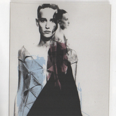
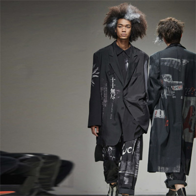
The graphics of Paul Bouden best exemplify Yohji’s work, they are themselves urban textures. The models are not the central or the total composition they are elements of a larger whole, often a scaleless composition, overlaid and transparent and always very masculine. They are rough edged, printed across the binding of a book or magazine with a very limited tonal range, graffiti, or music posters on the shuttering that surrounds building sites, temporary, passing through but with a prescience that expands, once noticed. This aesthetic spill back into Yamamoto’s later collection where image is used across clothes as if graffitied post fabrication.
Ultimately in designing clothes Yamamoto designs men’s clothes for his own taste, and women’s clothes how he believes they should be represented. He designs men’s clothes that he would like to wear, and women’s clothes that empower, clothes that describe the way he feels about the world and by sales many others feel that way too.
Images
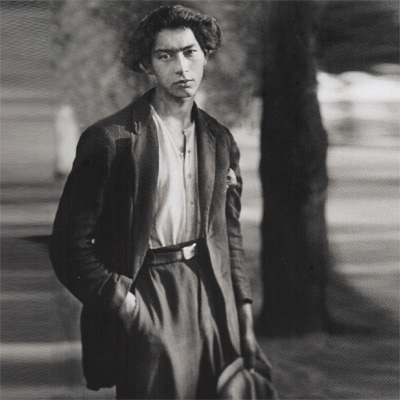
- 1. 1930c Gypsy, August Sander
- 2. YY 2004 SS, Graphics, Paul Bouden
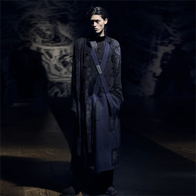
- 3. YY 2016 AW
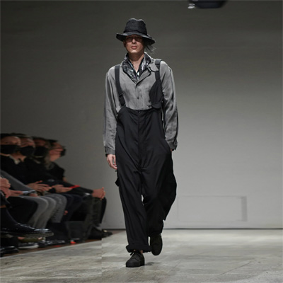
- 4. YY 2023 SS
- 5. YY 2021 SS
- 6. YY 2021 SS
- 7. YY 2023 SS




300320 – Van Gogh’s Shoes – The Relevance of Mis-Readings – London > words
Pre-Amble One - Provenance and Value - The Relevance of Decoding
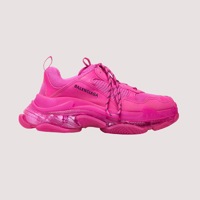
Pre-Amble Two – From Sportswear to Signaturewear - A Contemporary Portrait - Balenciaga Triple S Sneakers
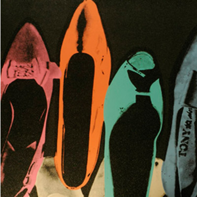
The Critics Previous Comparatives - Van Gogh’s Shoes vs Warhol’s Diamond Dust Shoes
Three images of Shoes – Van Gogh, Warhol, Balenciaga
Summation
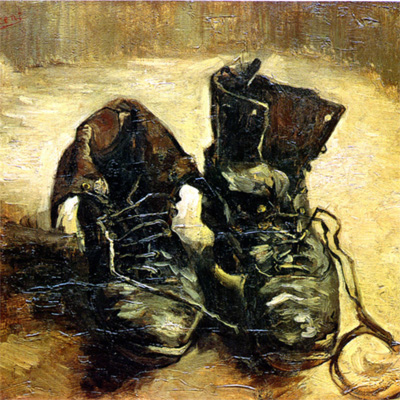
This essay looks at three images of shoes and reflects upon the societies that have produced them. The essay consists of five parts as outlined above. Three pictures of shoes, from left to right, one from 1886, one from 1980 and one from 2018. The first two images have been chosen as they have already received considerable attention, as outlined below. The third image, are a pair of shoes of today and represent aspects of today’s society. All three images represent time frames of culture, ongoing development and reappraisal.
Pre-Amble One - Provenance and Value
Provenance - The beginning of something's existence; something's origin.
Value - the regard that something is held to deserve; the importance, worth, or usefulness of something.
Provenance, history, association, gossip, story, rumour and endorsement, are all entities that affect our perception, acceptance and eventual evaluation of something. The provenance need not physically improve or alter a product, it need not be accurate and it need not be positive to have affect. Provenance can be fickle, have considerable consequence and a two-way effect as it re-evaluates. The object that receives ‘provenance’ is re-evaluated and the giver of ‘provenance’ is equally re-evaluated.
For example. A rock star is photographed sitting in a new sports car. The cars significance is increased. The rock star’s famous model boyfriend / girlfriend is photographed sitting in the passenger seat. The cars significance is increased again. The rock star is known to be a car enthusiast and has a large collection of cars. The cars significance is increased again. The rock star is known to compete in track days or amateur races. The cars significance is increased again. The rock star crashes the car. The cars significance is increased again. The rocks stars boyfriend / girlfriend is killed in the crash. The cars significance is increased again. The rock star is also killed in the crash. The cars significance is increased again. It makes little difference that the rock star may not have owned the car, that he was lent it by a famous brand as a means of endorsing their product, or that the rock star drove the car just under two miles before the fatal crash. The object that receives ‘provenance’ is re-evaluated and the giver of provenance is re-evaluated.
The above example is a fiction, but numerous examples exist. In December 1967 Elvis Presley walks into a car showroom and buys a gold 1968 Cadillac Eldorado Coupe. One morning the new Cadillac refuses to start and Elvis shoots it in the passenger side front wing, where the bullet hole still remains. In 2014 this damaged car is sold for ten times the market value of the equivalent car. Numerous examples exist of cars receiving provenance from celebrity association and of celebrities receiving provenance from their association to specific cars.
Provenance to products is transferable. Steve McQueen’s 1968 green 350 Mustang fastback, from the film Bullitt, which sold for $3.74m million in January 2020, is transferred to all 1968 green 350 Fastback Mustangs. It should be noted that Steve McQueen did not own the car but it was used by him to make the film. It should also be noted that the car sold was not the main car in the film (that was written off) but the stunt double car. Neither of these facts have altered the re-evaluation, the car via celluloid is inextricably linked to Steve Mc Queen and has been assimilated into popular culture. James Bond has done the same for Aston Martin and Lotus. Cars featured in the films Fast and Furious, Matrix or any popular film gain transferable provenance.
The above are easily accessible examples of cars, we can read about them daily, we can check prices on auction sites and numerous websites and magazines. But the same provenance / re-evaluation can be readily applied to more esoteric goods, such as Samurai swords, contemporary furniture, jewellery, fashion, architecture, memorabilia, art etc.
Artists can invent and enhance their own provenance. The Masters from the Renaissance would often include themselves as a background figure within an allegorical composition painting. This was often revealed only after the painting’s completion, sometimes not discovered until after the painter’s death. They would paint mysteries that needed to be deciphered and leave clues so that the painting could be read and more importantly endlessly re-read. The more times a story is told, enriched and embellished the more significance is added.
In Art, provenance is as, if not more important than the art itself. Provenance authenticates, it establishes the origin and hence the authenticity. This is why the art forgers first task is to convince the specialist. Eric Hebborn (1934-1996) was a struggling London painter, who purchased some paintings in a market and sold them to a gallery. The gallery put the paintings up for sale at thousands of pounds over what they had given Hebborn and he believed that the gallery had intentionally cheated him. Hebborn set out to get his revenge, at first on the art experts at the gallery and then on art experts everywhere. Hebborn painted over 1000 pictures, in a range of styles, but the Old Masters was his speciality and sold them as originals. He was wise enough not to duplicate the originals but to study them and then produce preparatory drawings for existing or ‘missing’ paintings. Many of the world’s best museums bought and showed his paintings. Once a fake had been established as authentic, it is logged and archived and the fake itself becomes a means by which authenticity of other works are judged. Hebborn was an expert in drawing, ageing and dating his works. He would provide a sketchy but well-researched history and then allow the experts to make all the connections as expert authentication adds value and re-evaluates the piece. When the forger is eventually discovered, their fame endorses their own work, and some have then set up studios creating ‘authentic’ forgeries, exact copies of famous works signed by themselves.
Contemporary artists know very well the value of provenance and create both the work and the back-story. Damien Hurst’s, ‘Treasures From The Wreck of The Unbelievable’, composed of broken, barnacled and aged sculptures are sunk off the east African coast to be discovered in 2008 and retrieved. The sculptures are supposed to be that of Cif Amotan II, a collector of antiquities, from the second century CE. The whole process of discovery and retrieval is fully documented, catalogued and filmed. The fictional back-story is in itself a piece of art as that of the sculptures themselves. In 1918 Banksy’s ‘Girl With Balloon’ is put up for sale at a Sotheby’s auction. It sells for $1.37 million. As the hammer falls on the sale, a hidden shredder inside its frame begins to shred the recently purchased painting. The painting is shredded halfway. The auctioneers look at each other in horror, but they have completely missed the cue as the painting has just considerably increased in value. It is possibly now Banksy’s most famous painting. Banksy had intended for the painting to fully shred but the shredder hidden in the frame malfunctioned and the painting was shred only halfway leaving half in the frame and the shredded half hanging from the frame. This was by far the better conclusion, exceeding the intended, as the work records and displays its own provenance.
You may ask what has any of this to do with Culture or High Art, surely this is simply market manipulation for commercial gain? The answer is Yes and No. Designed objects and works of art are records or cultural stepping stones, they document the values and beliefs from within a specific time frame. Artists and designers are windows and conduits for recording cultural history and markets are intrinsically linked to our cultural history. Democracy, globalisation and popular culture are, in the present time frame, uniquely interrelated and art and design have adjusted to this. High Art, often takes an aloof stance, but it is very much part and product of the same system that generates understanding and culture.
Pre-Amble Two – From Sportswear to Signature Wear
To make any sense of the third image some historical background information is required regarding a genre of clothing that emerged in the twentieth century. Sportswear, leisurewear and casualwear have been grouped as the same genre of clothing as they have become hybrids of each other in contemporary fashion. Sportswear entered fashion via small complimentary collections within the French high fashion houses of the 1920’s. Women started to wear looser fitting clothes and began participating in sports such as tennis, golf and swimming. Sportswear was a minor part of these collections and still often made bespoke for women of the leisure classes. However, sportswear is really America’s Post War contribution to fashion, linked to the growth of ready to wear and interchangeable separates, where it became increasingly part of the fast-paced American female wardrobe. American sportswear was seen as an expression of middle-class values, including comfort, function, health and the concept of democracy. The established eight-hour day, five day working week enabled a growth in leisure time for all classes and clothing was required to embrace this new found freedom. Advertisements for women began to embrace the ‘American look’ of good health, good teeth, good grooming, fit and free. American sportswear designers focused on mass produced, affordable, versatile, easy wear garments. While the post war Paris fashion houses imposed their styles on their wealthy clients, American sportswear was widely available, encouraged self-expression, and accessible to all and as such, seen to be democratic. During the 1970’s Ralph Lauren, Calvin Klein and Perry Ellis produced sportswear made in natural fibres, brushed cotton, wool mixes and linen. By the late 1970’s American designers were producing extremely simple garments in high quality fabrics that have become modern classics and these have barely changed over the years. Casual had become minimal, with simple clean cuts. These fashions were endorsed on a global stage by America’s command of film and music, through these mediums they expressed new youthful freedoms, new independent ways to live, the all-American lifestyle.
As the lines between sports and casual wear became blurred and mixed, the music of the 1980’s and 1990’s opened new possibilities for this type of apparel. Popular culture saw the music of the 60’s and 70’s as a visual spectator-based recreation. The music of the 80’s and 90’s was far more activity based and dance orientated and this evolved a clothing style appropriate for the new genres. At the same time global access to TV had popularised sports at a domestic and international level. Teams with their colours, hierarchal uniforms and brand association gained a popular following among fans. Popular culture and business were inseparable as money follows and manipulates the markets. Street fashion, from necessity, has to be inventive on a budget. Mixing second hand separates and casuals with sportswear was an easy and practical step, layering all of these into a new streetwear most recognisable through the Hip-Hop scenes of the 80’s and 90’s who often wore the uniforms of one brand, adidas, Nike etc. Further into this mix came other forms of street culture as leisure time amongst the young increased. Skateboards, Surfing, BMX, B-Boys all had their own dress codes. Leisure became increasingly activity based or at least one could dress with the resemblance of association to an activity lifestyle. Clothes became tribal through association but tribal within a global catchment of popular genres. Mass markets had huge financial potentials and the big brands followed this. Soon the alternative became mainstream, break-dancing, surfing, BMX, became international sponsored events and ambassadors from within the scenes were courted by brands and able to earn considerable incomes. Brand Ambassadors and Influencers could be seen in the front rows at the catwalks of high fashion.
High fashion had to reinvent itself to follow the markets. Couture, bespoke and quality were replaced with the creation of ‘Difference’. Signature clothes replaced tailored clothes, from Generation X (1961) onwards, the youth market, that may have baulked at spending $800 on a new suit, would gladly spend that on the correctly tagged t-shirts or trainers. ‘Difference’ through fast turnover, limited availability and immediate association became the call of the Instagram society. Flags were worn, Brands brandished, Tags noted, all signifiers of association to a particular lifestyle and attitude to life. When brands such as Gucci adopt the mix of street fashions and place multi thousand-dollar price tags on them, this appropriation is self-reinforcing. Drawing from popular culture and directly feeding into popular culture enables the media to manipulate and create new markets. Demna Gvasalia, the creative director of Balenciaga, explains how luxury products have changed. “The emphasis has gone from quality and craftsmanship into the uniqueness of the product, A high price tag isn’t the only way to ensure scarcity. Streetwear brands have pioneered a strategy called “the drop,” where they let new products trickle into stores in small quantities on a regular basis, scarcity has fuelled a massive secondary market” The role of music and the fictive alternate lifestyles developed within club culture should not be underestimated. In the US alone Hip-Hop has the largest following of the music genres, at around 25% of total market sales, it is now a multi-billion-dollar industry. Product endorsements and limited-edition signature ranges have made many Hip-Hop celebrities incredibly wealthy and with their wealth and fame their endorsement value grows. Rappers are no longer just Rappers but instead company CEO’s, designers, actors and market influencers. The web has helped enforce and aid the growth of this mix.
High fashion has adapted, it no longer takes an aloof stance but instead is more a mirror of society. Street fashion with its influences from sportswear, clubwear, gaming and anime is absorbed by the fashion house, deconstructed, re-worked, re-composed, styled with an exaggerated edge. The material technicity of sportswear, 3D fabric forming, moulding, bonding, makes the whole look progressive and futuristic. This is intrinsically linked to digital communication, film stingers, sound-bites, hyper-real and interactive graphics, all of which help create these super-intense aspirational worlds created within ads. Instant digital media is a condensed experience, a thick syrup of real life, delivered in a few mega-bites of data and as such, an inaccessible simulacra, a hyper-real simulation of a reality that never existed. This offering of the unobtainable can be purchased through symbolic association and this symbolic association has a greater value in today’s society than the traditional quality and craft of making that would have been associated with previous fashions.
The wealthy are able to live in a multi-stratified world above the everyday. Here, they inhabit a world based upon choice, to either live inside or outside reality whenever the occasion requires. The majority of the population have little choice when directing their own lives, and respond daily to circumstance. Most can barely keep up with the cost of reality, they can hardly afford their cities, the major part of their life consumed by the cost of existence. The repetitious banality of the everyday is endured through the escape into fictive realms. These would once have been those of the story teller or the novel, today, its first point of call is TV and the internet, its second is music and club culture and its third would be the packaged tour or themed event. In these realms hope, optimism, group acceptance and personal success are superficially achievable in this digitised or themed, socially mobile, the American Dream. Where once the t-shirt, as signifier was the substitute for one’s own reality, today we have avatars, online identities, photoshopped ideal personas complete with imaginary CV’s. Reality has no place in these fictive worlds. Optimism, hope and moral justice, once the realm of the religious parable or folklore fairy tales are now part of everyday popular culture. In these fictive worlds super heroes abound. Those fictive super heroes that have been lucky enough to have mutated, have developed super powers and dress accordingly. They inhabit our gaming culture and our action films. These fictive worlds feed back into reality, through role play, fandom, adoption of gesture and mannerisms, clothing and merchandising. Manga films inspire Cosplay and Harajuku cultures that fill clubland and overspill into our urban environments. The fashion world mirrors this and gives it a more credible edge and makes it available to the mass markets.
Just as Warhol commodified celebrities through image, here activity and myth have been commodified. For the very few that dedicate their lives to pushing the limits of their alternative arts, be it BMX, Skateboarding or B-Boying etc. the majority are satisfied with association through tags. It requires no skill to wear a t-shirt, grow a beard or adorn a tattoo but all of these signifiers carry a disproportionate significance with regard to the owner’s personal achievements. The skilled individual has been outcast, he/she has been replaced by this new tag enhanced collective popular culture that gains strength from unity and identity and this group identity can be commodified.
The Critics Previous Comparatives
Above we are presented with three images, two of these have gained in notoriety due to receiving considerable critical attention and have from this had to be re-assessed and re-evaluated. The two paintings, both simple paintings of shoes, have been the subject of much discussion with regard to both the interpretation and role of Art within society and culture. The paintings are Van Gogh’s Shoes and Andy Warhol’s Diamond Dust Shoes. What has previously been said about these two pictures needs to be outlined to be contextualised. These images of course, were not chosen at random, they are images more famous for the critic’s discussions around their meaning than as artisan exercises in the representation of a still life. So, it would seem appropriate, to start at the beginning with that controversial paragraph, written eighty-five years ago, that set all this dialogue in motion
“From the dark opening of the worn insides of the shoes the toilsome tread of the worker stares forth. In the stiffly rugged heaviness of the shoes there is the accumulated tenacity of her slow trudge through the far-spreading and ever-uniform furrows of the field swept by a raw wind. On the leather lie the dampness and richness of the soil. Under the soles slides the loneliness of the field-path as evening falls. In the shoes vibrates the silent call of the earth, its quiet gift of the ripening grain and its unexplained self-refusal in the fallow desolation of the wintry field. This equipment is pervaded by uncomplaining anxiety as to the certainty of bread, the wordless joy of having once more withstood want, the trembling before the impending childbed and shivering at the surrounding menace of death. This equipment belongs to the earth, and it is protected in the world of the peasant woman. From out of this protected belonging the equipment itself rises to its resting-within-itself.”
In this quote from ‘The Origin of a Work of Art’, 1935, Martin Heidegger, the wordsmith, does what he does best and offers a worthy phenomenological description. Heidegger’s text trembles overwhelmed by his individual interpretation of this painting in which he puts emphasis upon the owner of the shoes as a means of interpreting the painting. Heidegger also puts emphasis on societies need to understand a painting by reading into the subject the personal context. Here he portrays the shoes as that of a peasant woman and he reads the painting as representative of her personal struggle to survive the harsh realities of life. Heidegger’s text is focussed around the assumption that these shoes are that of a peasant woman, unfortunately this assumption is almost certainly flawed.
In ‘The Still Life as a Personal Object’, 1968, Meyer Schapiro criticises Heidegger and re-writes the painting in his own image, replacing the peasant woman as the owner of the shoes with the shoes being Van Gogh’s own. Schapiro sees the painting as a self-portrait by the artist to represent his life’s struggle for acceptance and artistic recognition. This reading is probably more accurate as we know from Gauguin that Van Gogh painted several paintings of his own shoes.
In ‘The Truth in Painting’, 1976, Jacques Derrida picks up the baton and both critics are hit again, this time with the lengthy polyphonic virtuosity of Derrida’s endless semantic riddles. At one point during his text he invites the reader, to read, in full, the original Heidegger text in both German and then in both French and English translations. He questions assumptions made by both Heidegger and Schapiro around the ideas of ownership and if the shoes are even a pair. Derrida finds fault in the two previous critiques but offers little in the way of a reading.
Frederic Jameson picks this up yet again in ‘Postmodernism or The Cultural Logic of Late Capitalism’ 1984, and compares two readings of the Van Gogh’s shoes and agrees with the possibility of each. He then adds as a comparative Andy Warhol’s Diamond Dust Shoes. (Although both the Van Gogh’s painting of boots and Warhol’s painting of shoes referenced by Jameson (p10a&b) are both incorrect images). Jameson suggests that the methods of reading the Modern, Van Gogh painting, cannot be applied to the Warhol Postmodern painting and his interest is in why these previous methods of art interpretation are now inappropriate.
The Van Gogh shoes high claim to fame comes not directly from the painting or the painter, but from the attention the painting received from critics and writers. This single pair of shoes, on a yellow background, was to become fuel for philosophers as they questioned arts role, its meaning and how it is perceived and interpreted. To make any sense of these texts one has to put them in the context of the critic. Each of these essays shifts the focus of content from the painting to the content of the previous criticism. They are conversations in time and are important as they reveal as much about the context and time in which they were written as they do about the original painting. Equally important is how that written context is viewed in the present. The essays show how perception changes with time and context and how societies develop within the flux of constant self-reappraisal. So, now let us try to contextualise the paintings and the critiques of the paintings beginning with Van Gogh, the original author and the following chronological sequence of critiques. Contrary to Derrida, to be able to offer any reading one needs to begin with educated assumptions. These assumptions are of course made from within this present time frame and as with the previous readings this context is in a constant state of flux but a snapshot time frame is required and is very much a component of that flux.
The source of the shoes will always be inconclusive, two personal variants exist. One is that Van Gogh bought a pair of old working boots from a Paris flee market in 1886 and took them back to his studio in the Montmartre district of Paris. It is known that he tried to wear them but they did not fit so instead he used them as a subject for a painting. Gaugin however offers another slightly more credible story. Having lived with Van Gogh in Arles in 1888. Gaugin asks him about the painting of the shoes, by this time there would be several paintings of shoes that had been made between 1886-88. Van Gogh replies “My father,” he said, “was a pastor, and at his urging I pursued theological studies in order to prepare for my future vocation. As a young pastor I left for Belgium one fine morning without telling my family to preach the gospel in the factories, not as I had been taught but as I understood it myself. These shoes, as you see, have bravely endured the fatigue of that trip.” If this story is to be believed, then for Van Gogh the shoes were a memorable piece of his own life, a sacred relic. The shoes represent the essence of himself, a homage of his struggle to share his beliefs. Van Gogh sees beauty in honesty and simplicity. However, the shoes paintings may simple have been experiments in paint and render. Impressionism, including Van Gogh’s own Impressionism was being invented on the run, canvas by canvas. The meaning of this non allegorical painting is a subconscious sensorial transference, a feeling about oneself and the time in which one lives.
Famously Van Gogh only sold one painting during his lifetime, as a struggling artist models were beyond his means, he had no clients or patrons, his paintings were unwanted. He was working at a time of great industrial disruption in both the cities and countryside, where mechanisation had replaced manual labour, the mechanical camera now captured realism better than the artist could. Impressionists sort to capture feeling and mood, tinged with nostalgia for a fast disappearing rural idyll. Industrialisation is a great gatherer and accumulator, bringing together collective labour, previously widespread resources, dispersed capital funding, all are focused to serve the machine and its products. An alienating overview, heartfelt, if not fully perceived at the time of Van Gogh. The Impressionists were part of a collective reaction to these times and a conduit for this reaction. Van Gogh’s shoe painting, torn between struggle verses optimism, represent a generic portrait of the common man, weathered and beaten, set against a background of ochre, Van Gogh’s ‘Happy Yellow’.
Heidegger’s text comes from an entirely different context, that of the established academic. Heidegger came across Van Gogh’s shoe painting at an exhibition in Amsterdam in 1930, forty-six years after the shoes were painted. Van Gogh’s work had now transcended from unwanted to collectable, its social status and influence increased by its new found financial value. Impressionism is no longer the art world’s young antagonist upstart but is now a respected and acknowledged historical Art movement of which Van Gogh was part. His life as a struggling artist, his bouts of insanity linked to chronic depression and his eventual suicide all add to his works provenance. In 1930 Heidegger is an established intellectual and academic, his Being and Time was published 1927 and was well received and highly influential. 1930 sits in the midst of two World Wars of which Heidegger had already served in WWI. Germany is in the midst of an identity crisis; post WWI hyper-inflation had desolated the country. The industrial Ruhr valley was controlled by France. Germany seeks unity and stability through Nationalism and Fascism is endemic. Heidegger, by 1933, was a full member of the Nazi Party.
Heidegger saw art as not merely the representation of the way things are but as a product of society’s shared understanding. For him, every time a new artwork was added to a culture, the meaning of what it is to exist is inherently changed as art is a form of reappraisal. The artist is not in control of the artwork, art itself, a product of culture, becomes a force that uses the artist for its own purpose. Art must therefore be considered in the context and time of its creation. The artwork is about the painter who painted it, how it was painted, the subject and its context. In Van Gogh’s painting, this is the owner and maker of the boots. Art by its very nature is not a scientific text, readings are interpretations that in themselves become minor artworks. The psychoanalytical works of Sigmund Freud were influential and well-read among academics, the sub-conscious, free association and transference were central to the analytical process. Van Gogh’s ongoing battle with depression and his eventual suicide would be irresistible to Freudian methods of analysis. All of this would put emphasis on the place of the individual within society. Heidegger takes an aloof stance, looking down on the his assumed owner of the shoes, the peasant woman, as a fraught lone individual.
The opening quote of this essay, is Heidegger’s elaboration, his interpretation from the perspective of Heidegger, a German intellectual, written a generation away from the painting’s original conception. Much has been written of Heidegger’s search for ‘the meaning of things’, his work has been extremely influential among the Existentialists. The search for meaning in a world ripped apart by the chaos of World Wars, where mankind’s devoted and constructive energy is put towards the building of machines of mass destruction, would seem an essential existential need. Hyper-inflation and commercial fiscal instability, would further query the reality of the everyday and its meaning and purpose. Heidegger’s phenomenological reading may be a fanciful over-reading of an image but his methodology is considered and has become an incorporated method of art criticism. However, ‘meaning’ read into paintings, as phenomenological description, contextualise a cultures perspective upon a subject (the shoe painting) within Heidegger’s time frame. This critic and painting are then viewed from the cultural perspective of the present. This continued reaffirmation is the means by which collective knowledge is accumulated dispersed and reinvented.
For Meyer Schapiro, an art historian as opposed to Heidegger the philosopher, shifts the context again. In ‘The Still Life as a Personal Object’, 1968. Schapiro sees Van Gogh’s shoes as a self-portrait without the artist being present. In isolating his own old, well-worn shoes on a canvas, he turns them to the audience. Shoes bear all the burden of struggle, age and fatigue, they stain with time, crack with age and wear out from the pressure and heaviness of one’s daily mobile tasks. They mark the owner’s station in life, his predicament, his inescapable position in society. In the painting of the shoes, the artist, Van Gogh stands naked but invisible. Schapiro’s reading is from the context of post WWII America. Fascist Nationalism has been set aside and replaced by Marxist Socialism, here the individuals voice and the individuals struggle have value and Schapiro concludes the painting to be a self-portrait. Schapiro had considerable knowledge of European history and the historical context in which paintings were produced, his first book in 1950 was on Van Gogh.
In 1978, Jacques Derrida returns to the subject of Van Gogh’s shoes in ‘The Truth in Painting’. Derrida’s Deconstructive stance is in line with Postmodernists rejection of metanarratives and universal truths. He concentrates on the dialogue between Heidegger and Schapiro and deconstructs each case by emphasising that there are no truths to the assumptions made within each text. He puts emphasis on the assumption of ownership, whose shoes are they, but also on the assumption that the shoes are a pair. Derrida reads through the critiques and builds an attorney’s case, questioning every assumption made by the previous critics about the painting. Often this can be an exercise in grammatology or the precise meaning of individual words. The original painting becomes a background subject and the dialogue around the subject has precedence. Although many of the points mentioned by Derrida have relevance, assumptions need to be made to offer a reading or to even begin a constructive conversation. Derrida’s text comes from a period of cultural self-questioning. The Modern Movement, with its universal reductive rules, had been seen by many to have failed, Postmodernism offered a new plurality but not necessarily a direction, it offered a means of re-evaluation but not a conclusion, as a conclusion would be just another metanarrative, an imposed truth. Derrida’s text is written in the first person, as if it is a conversation about possibilities and interpretations. It is set without the forming ground of opinion, it assumes that the basis of critical opinion has plurality and is always in flux, the Postmodern age being a time of incessant choosing. Van Gogh’s shoes were composed by Van Gogh within his time frame and context. Criticism of Van Gogh’s shoes are equally composed within their own time frame and context. The flux associated with the readings come from the passage of time and not from the moment in time.
Jameson suggests that these hermeneutic readings of the Van Gogh’s painting are possible as the work has imbued depth, as its author has considered each brush stroke, controlled its direction and texture, selected the tonal range of the colour pallet, arranged and rearranged the composition and chosen the framing and the juxtaposition of background. The author has filled the canvas with feeling, his persona and his temperament. Jameson sees the van Gogh work as an inert object form and should be read as evidence of some vaster reality which replaces it as its ultimate truth.
Jameson goes on to compare Van Gogh’s shoes with Warhol’s Diamond Dust Shoes, however, compared to the Warhol painting, already flattened twice, through the mechanical process of reproduction, photograph and the silk screen, this image is a simulacra that cannot be read in the same way or contain the same depth of meaning as the Modern Van Gogh painting. Frederic suggests that the Warhol shoes are distant, and cannot contain the intimacy of the Van Gogh shoes and that the Diamond Dust Shoes histories are unable to be identified. Instead we have a random collection of dead objects that we are unable to restore to a larger lived context. Warhol through the commodification of objects transfers its subjects, even celebrity human subjects such as Marilyn Monroe, into commodities of their own image. To surmise Frederic the Van Gogh’s painting is grounded in its materiality, the material of paint and canvass, the materials of the shoes and the shoes use by people. The Warhol shoes lack materiality as they have been moved into the world of exchange value, of surfaces and play, a simulation, a copy for which there is no original.
Three images of Shoes
What is the relevance of these essays with regard to Culture and their Cultural contribution? Are they too esoteric to have any purpose or meaning? When isolated as individual essays they are indeed sole critiques of the subject but when considered as a collective their interpretations re-evaluate societies values and direction. Heidegger, Schapiro and Derrida, when they are not disseminating each-others text focus on who the shoes belong to and from that context a precis can be formed. Van Gogh painted six paintings of old shoes and in every painting the shoes are isolated. Of these six, the painting above is the picture of prime relevance to the art world. The six paintings are still life’s and exercises in technique, Van Gogh painted because he enjoyed painting, it allowed him to cope with life. The shoes may have all been his or may not. The value of the shoe painting pictured is not of the individual but of the historic period that it represents. Heidegger’s contextual reading of the painting, as methodology, is important but subjective over reading into the personal misses the paintings historic relevance. Schapiro’s criticism of Heidegger challenges the shoe ownership and describes the painting as a Van Gogh self-portrait, without the artist being present. Derrida takes both Heidegger’s and Schapiro’s texts as being heavily flawed, and like a prosecution attorney lists faults in each case. He pulls the critiques apart but then leaves the pieces on the table, as a Postmodern critic, he refuses to conclude by inferring an alternative metanarrative. Jameson looks at the methodologies used in the formation of the previous critiques and argues that the same methods cannot be used to assess contemporary art as contemporary art has been stripped of imbued meaning. The Warhol painting has been distanced from the observer by the mechanisation of its production and by the mechanised production of its subject shoes, both shoe and painting are exchange value commodities.
It is worth looking at these two paintings again from the present perspective to form an assessment outside of the previous critiques and to add to these a new image of a contemporary shoe. Three images of shoes spanning 132 years of time, in which societies relationship to each shoe, its purpose and meaning has undergone considerable change, as societies and their values have changed.
In 1886 the Van Gogh shoes would have been made by hand, they took time to make, they were organic, made of life, they are embedded with sacrifice both in their procurement and in their use. They age as natural materials age, crease and crack, weather as skin. The shoes would be expensive items to buy, saved up for over time and yet an essential necessity, a survival item. The owner would look after them, repair them, they are intended to have longevity. With time and wear they become more like the owner. The relationship to the object becomes one of shared experience and stops being one of possession. The painting can be read as a portrait of the generic working man set within a time frame of great transition. After the invention of the camera, Van Gogh like all impressionists was searching for a means of emotive representation and this involved experiments in technique. The Impressionists had a nostalgia for the past as a rooted reaction to the uncertainty of the future. In the shoe painting Van Gogh frames the canvass. The shoes face forwards, confronting the audience. Frontal, questioning, laces undone, step into my shoes? The shoes are painted in isolation on a background that sets mood but is non descriptive or revealing. The background is mainly of yellows and ochres, to Van Gogh, optimistic happy colours. He famously once ate yellow paint in an attempt to become happy. The framing is static, not quite square but of the proportion that puts the subject in the position of centre focus. All of these attributes are techniques of portraiture. The shoes are presented as a portrait but not necessarily of an individual but instead of a displaced generation in turmoil. A generation in which all precedents are questioned, religion due to science, craft due to mechanisation, displacement due to industrialisation, meaning, value and authenticity due to mechanical reproduction. For a generation, all these values that were once solid are now transitory, in the process of great change and/or slowly disappearing. This test of inherent values and man’s displacement has been represented by the portrait of the invisible generic owner of these shoes. These personal, valuable, essential utilities.
Numerous versions of Andy Warhol’s Diamond Dust Shoe’s, like the Van Gogh’s shoes, exist. Warhol, when working as a commercial illustrator for the fashion industry first created his Diamond Dust Shoes in 1950. These have probably been retrospectively titled as Warhol did not come across the technique of adding Diamond Dust to a screen print until 1979. Warhol revisits the shoe subject in the 1980’s again for a commercial ad-campaign for the fashion designer Roy Halston Frowick (Halston). A large box of Halston shoes arrived at Warhol’s studio where Ronnie Cultrone, Warhol’s assistant, tipped them onto the floor, Warhol liked the way the spontaneous arrangement looked and took Polaroids. The Polaroid was the favoured medium of Warhol’s for recording image, it was quick, immediate, its colours poster like and acidic and it was disposable, an instant gift. Warhol would choose a Polaroid image to be sent to the lab and enlarged, turned into a monochrome screen print, to which Warhol would then add further colour. Diamond Dust was then added to the surface of the screen print. Diamond Dust is a ground glitter from a natural crystal, although Warhol preferred to use ground glass. Glass a low-cost commercial product, is used to create literal glamour, a mass-produced material used to create the illusion of wealth. The Diamond Dust addition gives an appropriate shimmer, a reflection of mirror ball glitz and the disco lamé of Studio 54 and of 1980’s New York.
As a bought mass-produced commodity, the shoe’s inherent value has decreased, craftmanship has been replaced by choice, choice of style, choice of colour, choice of occasion. As a commodity the specifics that once made it a shoe are lost, it is now a commodity like any other, a fridge, a car, a biro. The Warhol shoe is an object that faces an identity crisis, stripped of its history, its heritage, its craft and its skilled time laboured making, all of these qualities have now gone. In the same way as the photograph and the silk-screen flattened the image, the making of the mass-produced shoe flattens the shoe. Its previous cultural associations, those of craft, skill and quality are replicated by an embossed surface pattern and/or replicated image. How does this new commodity shoe replace the value once associated with quality of material and craft skill? How does any mass-produced commodity, such as a biro or a mass-produced shoe contain value beyond its production value? The ultimate Warhol mass-produced shoe would have been the Croc, that jelly mould regurgitation of an object disguised as a shoe. If Crocs had been silk-screened, they would be the perfect Warhol product.
Contrary to Jameson, a Postmodern painting also invites interpretation, a decoding to develop and complete the world represented which is beyond what can be physically captured by paint on canvas. In a Postmodern work, the image has been flattened limiting interpretation, making it depthless and superficial. Aesthetic production today is part of, and cannot be separated from, the broader general production of commodities. The Warhol shoes are mass produced commodities, there is not a pair as that would indicate a person and offer the interpretation of a persona, instead we have a random arrangement of colour, styles and sizes. The shoes are not displayed but instead displaced, left over, consumed, pre-used, a line of superficial choices for a market that creates superficial needs. Shoes no longer wear out, they are exchanged as the occasion determines or as fashion dictates. Consumer culture creates the desirable from the mass produced. The shoes value is that of currency, their exchange value. Societies priority value is that of ownership, collections of possessions, shoes, properties, companies. Ownership has greater value than use, collections of shoes that may be bought but never worn, collections of properties, bought but never used. The shoes are possessions, badges or merit.
As Postmodern commodity culture develops and mutates, the commodity has become the inherited identity of the owner, representing their choices, values and status. The shoe once a utility, then a badge or merit, now become a signifier of association. Marketing understands that pre-loading the commodity with associative provenance enhances the commodities value. Provenance is acquired through associated ‘stories’, often fictive. The commodity becomes a symbol representing an association to a lifestyle or to a group. Markets and popular culture encourage this signifier to be representative of a collective tribal identity, in the world of the net and global communication the successful signifier can become viral. Post Wars, we now live in an image saturated world, where the image is the quickest and most direct form of communication. The rise of comic book culture and the medias increasing use of the photo essay, especially in newspapers and magazines, have become a powerful means of mass communication. This suited the new urban workforce, forever on the move, with limited time during frequent breaks. Film, chopped and edited, with interlaced stories and distance to close up framing, aerial shots and distorted perspectives, creates a space in a similar way to the photo essay and comic book. This has become the principal way for stories and spatial sequencing to be portrayed but this is far removed from the linear space-time in which we live our real lives.
The visual image is the ideal medium for the fictive world, the image of dreams, desires and aspirations. A fantasy world where we are happier, healthier more beautiful and more successful. It is a world saturated by multiple images, where space consists of a flickering collage of reference and association. Rauschenberg paintings of the mid 1960’s hint at this coming construction of space. Collaged multi-media space was fully absorbed in the 1980’s by popular music, where previously music was an acoustic medium. TV programmes such as MTV and others changed music from an acoustic to a visual medium using the purpose made music video. The music video, an elongated glamorised advertisement, cannibalised images, it mixed, references, sources, hierarchies, it stole everything. It was flattened, contextless, timeless and relentless, an intense collaged world to represent our new fictive realms. The MTV generation of the 1980’s was bombarded by images 24/7. They were immediate and instantaneous and became our new mythical religion, a world constructed of digital flickering frescoes. The music video became the background noise in every teenager’s bedroom, turn it on – leave it on, a world where everyone can live their dream.
This Postmodern image-based culture, where the image is loaded with signs, references and aspirations, where text is replaced by a visual language, has an almost medieval implication, similar to the fresco adorned churches, with their walls lined with images of a better world and a promised paradise. A promise that was accessible to all simply by following a set of rules. These aspirational mythic worlds offer escape from the everyday. The visual image was central to the spread of religions as it spanned literacy, language, culture and continents. Today, the visual image is now being used again as the central method of communication to globalisation world, for the very same reasons. The hyperreal, aspirational image, is a cartoon of the original, a condensed summation. It can be politically loaded, subjectively interpreted, it is a message for the masses. The modern aspirational lifestyle image is shown next to a tag, logo or brand name, the signifier of association. The sign flattens, the logo shortcuts. The rise of sportswear from leisure wear, with its adornment of tags and brand names has become fashions contribution to this new urban landscape where space is understood as a photo essay, a collage assembled from image bombardment. The majority of our education is now delivered on screen, also in the format of the film photo essay, for example, nature programmes, science programmes, history programmes, all real-world scientific subjects, use these methods. This has become the means by which we now comprehend and explain space, and therefore cannot be separated from the linear, real-world, space-time that we experience and inhabit. This overlay, understanding verses experience, is how our fictive and real-worlds merge, aspects of these fictive worlds inhabit our urban environments and are absorbed into societies and culture. These links tie the fictive and the real together, space understood as a photo essay, often mythical, and the linear space-time that we inhabit.
Van Gogh was a deeply religious man, the son of a Protestant minister who once considered following in his father’s footsteps to study Theology. Andy Warhol was a devout Catholic, he went to church often, sometimes daily, he met Popes and was buried under Catholic Rites. Both Van Gogh and Warhol believed in alternative spiritual worlds. Although education and science have yet to rid the world of religion, they have weakened religions global grip. It is interesting that technologies derived from science have been used to create, encourage and enhance other mythic worlds. These replacement utopias, like the religions before them, have aligned with commercial objectives and encouraged means of social control.
Space constructed through the medium of collage reinterprets established conditions of our spatial reality. Multi-media collage space can be constructed with multiple scales, it has no hierarchy, no gravity, it can be played forwards or backwards, in slow motion, speeded up or in real time, it can be live or historical, virtual or real, it can be augmented, supersaturated, hyperreal, greyscale, flattened or filtered, it can be layered, may contain text or signifiers, tags or logos, it may be synced to sound or have sampled sound running over or through it, it may be in a constant state of flux or totally static, its transitions may fade or morph, it paints mood, it agitates boundaries, it’s a space that bleeds. the perfect space for mythic worlds to be constructed, the perfect space where the real and the unreal become seamless. These idealised worlds as an image can be framed, sold and purchased, we can buy into this lifestyle. We are never sold a product, we are sold a dream, a space in which we can shape our new personas. Images satisfy this psychological need for an improved habitable space. The image when referenced by a tag, a soundbite, a catch phrase, a brand, a symbol, or a logo, is a powerful persuasive tool, an immediate shortcut,
We have become used to living alongside parallel fictive worlds, Europeans have amusement halls, cinemas, theatres and casinos, America had amusement parks but also has amusement cities, Las Vegas being the obvious example. The purpose and focus of Las Vegas, is that of entertainment and gambling, its architecture is totally artificial, representative of other cities and cultures. Robert Venturi describes Las Vegas as a ‘message’ city entirely made up of signs. In this essay one would probably ask, why put so much emphasis on simple items of clothing, on three images of footwear? Clothing is man’s first point of defence, practicality against the elements and secondly as a signifier of association and hierarchy. Clothing was one of man’s first tools, wrapping the body in fur as protection against the elements would later be transferred to skinned covered frames forming primitive tents and enclosures, the beginnings of architecture. Clothing and habitation are semantically linked and both are able to hold the memes of cultural expression. Clothing today, fashion, is then a codified utility in much the same way as architecture is, and architecture is an established historical archive of culture. Our commodities are no different to our architecture, each are loaded with the memetic traces of our time.
In the third image, the Balenciaga Triple S shoe, like the Van Gogh shoe, it is presented in isolation as a solitary object on a neutral canvas. It is however not a pair and makes no attempt to represent an individual persona. It is an object presented on an invisible plinth, an object of status, of attainment, of achievement. It is a badge, a monument, an award, a flag, an item for attention or treatment in a specific way. It is a symbol of admission and acceptance and represents a collective elite group, a select brotherhood. The Triple S shoe is no longer a utility. It is neither a sports-shoe, a work-shoe or a formal-shoe. It is a hybrid object that has gained its form from many sources. Its triple soles owe more to the fictive worlds of Manga cartoons or Transformers than to the world of the athlete. Its multiple layers of complex moulding, formally organic, have more in common with the aesthetic forms of insects or coleoptera than with the function of walking. The materials are synthetic, intricately three-dimensionally woven, in parts transparent, the colours lurid and acidic. The shoes are designed to lift their owner, to make the individual stand out. Many of the adornments are superfluous forms, stylistic additions, each referencing worlds outside of functionalism or ergonomics but also worlds outside of sportswear, casualwear or leisurewear.
The Triple S shoe is a signature, here we no longer wear shoes we wear signifiers and identity tags. The t-shirt, the original pop art signifier was once mono-denoting, a clear single message, Peace, Love, the name of a band. It is printed as a flat item, a worn political poster and only gains a third dimension from the process of being worn, it is a pure sign. With the Triple S shoe, the signifier has become a complete multi-faceted three-dimensional form. Multi-faceted as its form cites a range of eclectic multiple associative references to a collective of genres: digital, virtual, themed and real. Man creates prosthetics to enhance or enable activities, usually this enhancement is practical, the spear, the shovel, the hammer, but he also uses prosthetics as a means of cultural codified empowerment, make up, perfume, the suit, the military uniform. First and foremost the Tripe S shoe is a culturally codified item before it can be considered as a practical item. It is a form that has been generated from the blending of our many themed and fictive worlds into a three-dimensional worn entity. Its hybrid of sources, club culture, manga comic books, film, fashion and sports, then become an everyday part of our daily lives, a meme absorbed without notice, a further element within the urban environment that we inhabit, a ménage of our imaginary and real worlds.
Summation
In the three images represented the shoes value has changed from one of an essential utility, made of nature, incorporating time in their making and in their use. To a commodity of instant gratification, of mass-produced choice, themed and styled for a particular occasion but ultimately a possession. To the shoe as signifier, of a symbolic association to an often-fictive activity or a group, a mythical synthetic creation.
Images
1. Vincent van Gogh, Shoes, 1886
2. Andy Warhol, Diamond Dust Shoes, 1980
3. Balenciaga, Triple S Shoe, 2018
030219 – Christian Dior – V&A London > words
As one enters the Dior show at the V&A it is tempting to immediately begin comparisons between this and that of the V&A Alexander McQueen exhibition of 2015 but it is important first to establish the many differences between the two shows and the design houses that they represent. Alexander McQueen was very much a lone star that shone very brightly and briefly for two decades who had direct control over a tight and talented team that had grown their reputation from their student days into the beginnings of what was to become the fashion empire that we know today. McQueen’s fashion sits neatly within the Postmodern. Postmodern fashion as Postmodern Art was re-exploring the decorative, it was historically referential, thematic and heavily influenced by TV culture and the reproduced image. The Postmodern developed in a world saturated by visual media, where juxtaposition is an everyday event incurred simply by changing channels or turning a page. Art becomes culturally collagist, a mix of narratives, fictive or otherwise, directed into a persuasive thesis. The results are strong, dynamic, hyper-real and full of instant impact. The work of Alexander McQueen capitalised on all that is Postmodern and the work was slickly package and choreographed with Hollywood panache.
In contrast, the work from the Dior studio spans from the 1940’s through to the present day, almost eight decades. The exhibition includes the work of Dior and the subsequent six Creative Directors. The Dior atelier has its roots in the world of Beaux Arts, (La Belle Époque) Parisian Couture, it’s team is an army of highly skilled artisans accomplished in the esoteric crafts of appliqués, tulle, perlage, bolducs, moulage, plissés and many more exotic verbs. The work is subtle and sophisticated. Its impact is not always immediate but instead grows slowly as the piece reveals layer upon layer of work that has gone into crafting the final form. The McQueen and Dior shows both have a similar feel, the plan and procession, with compartmenting of collections into themed chapters to help explain an overview. Both shows had a very good pace with wonderful transitions between each spatial chapter but the Dior show is a slower walk.
There has been a move of late away from showing only final pieces, the famous profiles and the celebrity centred ensembles. The Dior show of course includes these but there is also an importance given to the making process, the development from initial sketch through to toile, the elaborate exercises in detail and applique through to the eventual marketing of the final piece. The white room with walls lined with samples, test pieces, calico toiles, exploring possible future conclusions is a delight. One can imagine how a sketch is translated through a toile via wrapping and working with the fabric on the mannequin, with heavy stitching and pinning holding each fold or pleat in place. Certain pieces still had chalk and pen lines marking areas for further alterations. This is work in progress and wonderfully raw, one can carefully observe the hand stitched structure that is the foundation of haute couture.
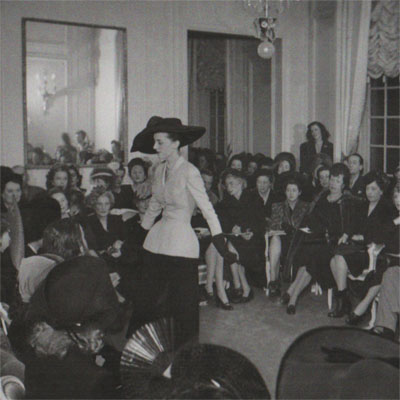
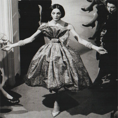
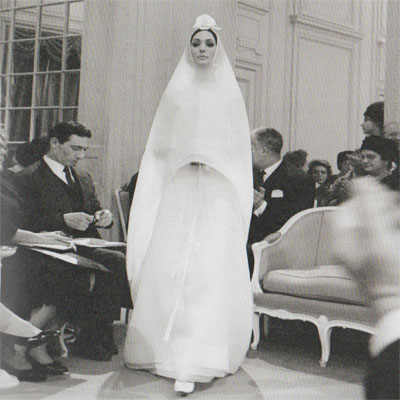
Dior’s ‘New Look’ caused much outrage upon its release, this was at first due to the amount of fabric used to create his full to the floor dresses (in many countries fabrics were still rationed post war). However the styles, with their full bust, pinched waist and voluminous hips were equally criticised as being too feminine, with concerns that women would be re-shackled as pre-war decorative and immobile ornaments. The Wars out of necessity had created a great independence and liberation for women and it is understandable that they were not keen to be ‘kept’ once more. The Wars had been brutal, leaving little of beauty or even the memory of beauty to remain; a counterpoint reaction was long overdue and well needed. The resultant Dior silhouette was to define fashion throughout the 50’s and in the process it would help establish France and Paris in particular as the fashion avant-garde. The French fashion industry grew and quickly diversified into accessories, perfumes and cosmetics helping to pull the nation out of the economic abyss left by the Wars.
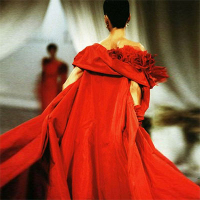
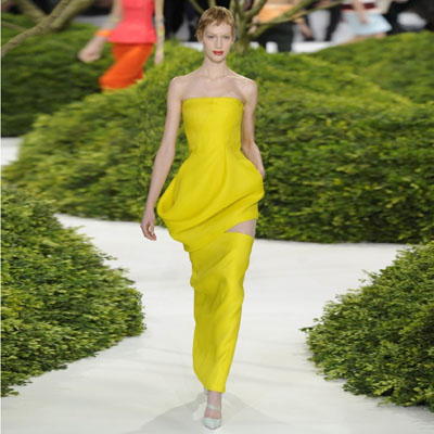
The continuity of the Dior House is emphasised as an on going directive. The works under Dior’s six Creative Directors, Yves Saint Laurent 1957-60, Marc Bohan 1960-89, Gianfranco Ferré 1989-97, John Galliano 1997-2011, Raf Simons 2012-15 and Maria Grazia Chiuri 2016 - present, stand alongside those of Dior. The continued inspiration from such a vast archive of works, with many contemporary re-iterations or past pieces, ensures an echo of the Dior brand through the decades. This has been to the benefit of the house and to the organisation of the show.
When one is presented with the concept sketch alongside the finished piece it is immediately apparent that there is a long journey of interpretation between the two. The sketches of any of the consecutive Creative Directors from Dior (1947) to Maria Grazia Chiuri (2019) are all very loose. The sketches capture the essence, feel or volume of a piece but little more. On examination, pockets, collars, folds, cuffs are all developed post sketch in the anonymous Ateliers of the Dior Couture house. This development from sketch to toile is not only where the bulk of the work of any garment is but also the most skilled work. Pattern cutter’s that turn an outline two-dimensional sketch into a three dimensional object are highly skilled and highly creative themselves, re-interpreting lines to actual forms that hold three-dimensional space. The people that do this work stay sadly, as unknowns in the shadows, and there are many further teams of these people each with their own speciality skill. In the workrooms the “Petites Mains” or seamstresses turn ideas into exquisite haute couture garments. The tradition of haute couture demands that the garments are almost entirely made by hand. Many complex pieces take hundreds of hours to complete. Within the “Arts et Métiers” of Paris there are artisans that work only on embroidery, pleating or bead work.
One also needs to contextualise the early work of Dior against contemporary culture of the time. Dior is presenting his collections at the same time as William de Kooning and Jackson Pollack are exploring abstract expressionism. Le Corbusier is designing Chandigarh and Ronchamp and Miles Davis and John Coltrane are beginning their experiments in improvised jazz. Dior’s “New Look” wasn’t really so new. Following the War, where women dressed more like men, the newness was really a return to an earlier time where women dressed as ‘women’. Dior said “ I design clothes for flower-like women”. The “New Look” revived Edwardian techniques and silhouettes but ultimately the craft of making was revived.
The early Dior collections were named after a cut with the focus on making, the A Line, the Y Line, the Natural Line, the Oblique Line’. St Laurent continues with this emphasis on the craft of making with his tailoring of the silhouette. Marc Bohan’s early collections follow suit but by the mid 60’s collections titles are cultural, the Mysterious Orient, Mexican Mood, African Style, but none of these collections really diverge from the main stream 60’s fashion, they are safe and conservative within the styles of the times. This continues through the 70’s and 80’s with works being refined mainstream. There are some more eclectic pieces like the 84 collection inspired by Klimt and Pollock, but these still fall within the large shouldered power dressing of the times. The Ferré collections of the early 90’s explore volume and asymmetrics, bold prints and juxtapositions, each collection is named but the name is not the driving inspirational force. It is corporate power dressing but there is a clear niche market being targeted. By the 90’s there are clearly collections with historic referencing such as the 93 Images In The Mirror Collection. The final collections of Ferré are mature, sophisticated and safe, all working well within the confines of Dior.
What is interesting when looking sequentially through all of the Dior collections under the six Creative Directors is as we move through the photographs chronologically from show to show, from Dior through St Laurent to Marc Bohan one notices how the background changes. The audience keeps getting younger and by the time we reach the mid 60’s there is truly a youth explosion. Markets have changed, youth is gaining independence and earning it's own capital earlier and the fashion markets follow this lead. Job opportunities begin to favour those that are able over those that are connected. Old systems once ruled by inherited wealth and the established hierarchies are at last breaking down. We can also witness how markets then realised that there is a premium within a brand and that this should be protected and developed. The Dior House was still fairly conservative, Dior became a corporate force when Bernard Arnault took control and brought in Ferré. Arnault built his fortune in real estate, by buying companies he was able to position himself into the high margin world of fashion. The fashion world is now run as a multinational conglomerate, this in turn brings capital into the industry, R&D budgets increase along with the quality and quantity of output. The 1980’s begins this cultural shift of commodification and globalisation. The 80’s experienced the ‘Big Bang’ here we truly begin to become global, everything becomes corporate, processed and mass market. Processed fashion, art, music – culture commoditised. The Dior 80’s collections are international, culturally neutral although still with a western world bias due to world capital allocations.
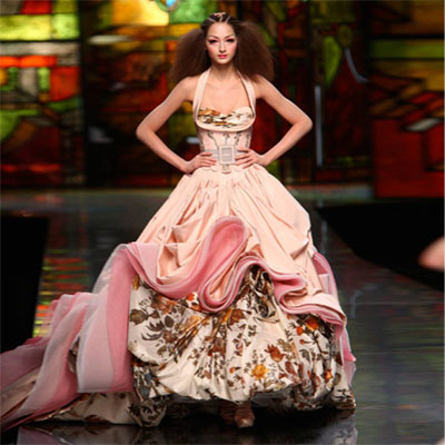
In the late 1990’s there is a massive cultural change under the directorship of Galliano. The work is revolutionary, inspirational, brave, it pushes the Dior House to expand its horizons. With Galliano Dior becomes an inventive fashion world leader. Galliano’s approach differs greatly from that of Dior, each live within their own times. By the 90’s his world has become thematic, a TV culture reference source. How does one reinforce the power of the Dior brand and avoid repetition. Galliano does this through the thematic. For his couture collections he would often (nearly always) take a team on a three-week cultural field trip, Mongolia, China, Peru, Russia, where they would immerse themselves in the culture visiting museums, theatres ballets and collecting material samples, beading, fans, photographs and cut-outs. This would then form the basis of the couture collection for each year. All of the Ready to Wear collections were then derivative of the annual couture collections. They took the essence and made it more wearable and commercially viable, the couture collections always working as the flagship for the brand. There is both design efficiency and marketing logic in this. This cultural scavenging, as one only ever gets the postcard version of a culture in a three-week trip, is totally of our media saturated times. From a trip to East Asia, Chinese, Japanese and Mongolian can all be freely intermixed they are merely reference material for the thematic. In this mix one creates the hyper-real Asian stereotype, the hi-tech, kung-fu calligraphic geisha. The stereotype we are used to seeing on TV, the representation of Asian culture that we now all understand, a copy, of a copy, of a copy. This is now a stereotype so powerful that even the Asian’s copy it. As the English now copy their Englishness, the French their Frenchness etc. It’s how we understand our world and fashion exploits what is current, making material the ephemeral. It could be suggested that it is fashions role to translate the ephemeral into the material, expressing the aspirations of the time and ignoring fashions of the recent past.
Our first visit to the Dior show was a push through the crowds, it is always difficult to fully appreciate a show when the exhibition spaces are crammed full of people. Luckily memberships and experience has allowed us the chance to visit these shows in blissful solitude. We managed to visit both the McQueen show and the Dior show when the galleries were completely empty, this has been such a luxury. But the answers I was looking for from our second visit to the Dior show failed to materialise. I was hoping to get a greater understanding of the making process. At the V&A 2017 Balenciaga show there were x-rays of the garments that exposed many of the hidden structures that helped hold a soft two-dimensional material into a complex three-dimensional form. The x-rays also revealed the many layers that build up the composite structures of layered fabrics. Stiffening webbing and felts, laid at cross grain with darts and cuts, sometimes with additional stiffeners, bone or wire, all of which make up the structure of these fashion composites. The techniques used offer transferable skills to many other fields of design. At the Dior show this level of understanding was still inaccessible. Perhaps the frustration came partly from my own lack of craft skill, I am not a tailor so I cannot pretend to think or understand like one but I understand materials and was still unable to gain full access to process.
In many ways fashion design is so different to many other design disciplines where the drawing is absolute and finite before the making process begins. In fashion a designer’s initial sketch can reveal so little, often only the essence of a piece. After there is a long creative process of further development left unrevealed, the process of wrapping, draping and falling; working hands-on with the mannequin, cutting, stitching, glueing, adding, subtracting and dressing. Although the media loves the idea of the maestro, the best design work is always a team effort with many skills working together towards a conclusion. The process is additive with each member of the team bringing their own specific skill. This difficult and lengthy procedure from sketch to conclusion is the very substance of design and the public need greater appreciation of this.
The most interesting conclusions gained from this show have been cultural, the transition from a director driven by the language of making to directors driven by the assemblage of image. The assemblage of image still feeds back into the language of making due to the established method of couture but there has been a slow drift, a detachment, between the creative process to the making process. Equally interesting has been the demographics of the target market that over the eight decades of the Dior House have become forever more youthful. This is partly due to youth empowerment and access to disposable income but is also very much a transition dictated through the incorporation of ready to wear collections. Large conglomerates require huge turnover and by definition these are popular culture markets.
Across the work of all of the Creative Directors presented at the Dior show, the delights are in the details and in the way detail compliments form, always part of the same sensitive dialogue, the same conversation, the same objective.
Seven images from seven directors. From left to right in choreographic order.
1. Dior - 1947
2. St Laurent - 1959
3. Marc Bohan - 1961
4. Gianfranco Ferré - 1989
5. Galliano - 2009
6. Raf Simonds - 2013
7. Grazia Churi - 2017
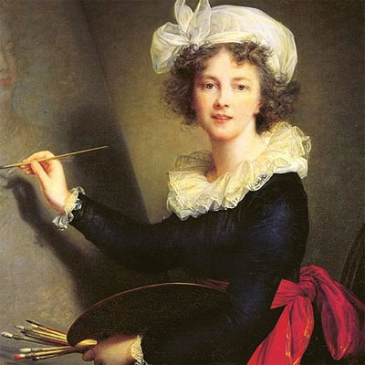
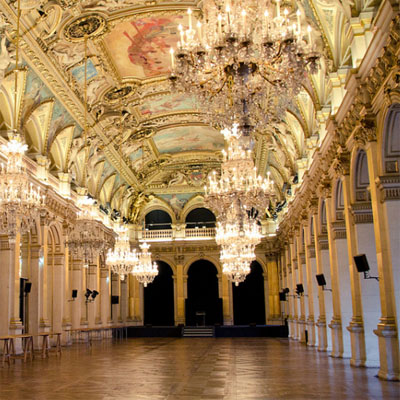
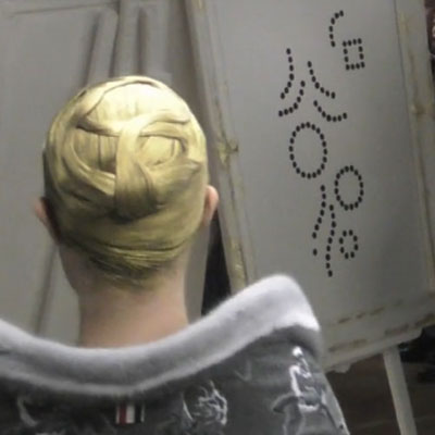
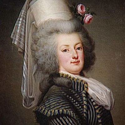
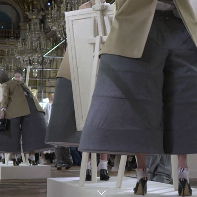
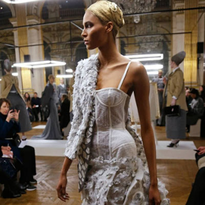

130318 - Chit Chat - Sarabande Foundation, London > words
Over the course of 45 minutes, Thom Browne the NY Fashion Designer gave nothing away. Unusually, Tim Blanks referred to a set of notes because he wanted to make sure that everything was ‘precise’, but his teasing questions did not seem to bring forth the answers one would expect to hear from a Designer whose work has always been based around theatrical uniformity, the conversation produced no further information than that already found in previous interviews and articles.
Maybe my expectations were too high as I was hoping that the conversation might have been biased to the recent FW18 Women’s show in Paris, 10 days ago.With a strong reference to Elisabeth Vigée Lebrun, 16 April 1755—30 March 1842, the female Neo Classical portraitist of Marie Antoinette, the Collection was seen through the eyes of her take on the 21st Century. The show itself was staged in the Hotel de Ville within la Salle des Fêtes, in the style of La Galerie des Glaces at Versailles, and also one of the main buildings at the forefront of the French Revolution. Models wore couture tailoring, the exaggeration of body proportions, boned and hooped garments reminiscent of the court fashions during the reign of Louis 16th and his Queen Marie Antoinette, with their gold hair matching that of the Neo Renaissance interior space.I would have been intrigued to find out if this was an intentional part of the story, or just coincidental?
I have had the opportunity to attend several talks/presentations across various subjects, but I find that my bias and enjoyment has been those given by Architects & Historians, with Fashion trailing behind, as the preparation, information and audience engagement on the prior rather than the latter are exemplary. The so called chat presentation becomes just that, an informal conversation which could easily be held in the front room, meandering across a series of questions with no clear direction or answers.
Perhaps the Fashion related ‘In Conversation’ pieces would benefit from taking a different angle. Rather than the informal chat around a coffee table, the Designer presents a selection of Design pieces and describes the process of how the end result was achieved. How did the pieces originate? Who and what determined the changes? How the fabric was chosen? How did this piece affect other pieces within the same Collection? How are the Show pieces then refined and adapted for production, made commercially viable and wearable? And more importantly how does the team work together throughout the process?
Surely the audience would feel more engaged with learning about this process and gain a better understanding how each Designer works, as the majority will have some connection with the topic of discussion, either as a student or worker in the industry.
At the end of these conversations, the bland chat puts a greater pressure on the audience to ask lengthy, irrelevant and more intellectualised questions as counterpoint. Where the questioner no longer continues the initial dialogue this leaves the conversation as it started, undirected and without conclusion.
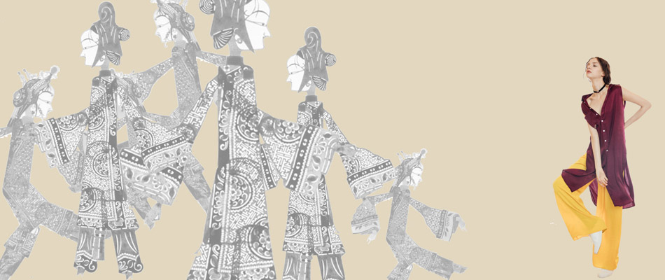
210717 – Canton Concept – London > words
China, once a great empire has spent many centuries in stagnation watching the rest of the world progress whilst playing a supporting role as the factory of the world. In a China where anything can be made and labour supply was cheap, Made in China became synonymous with both poor quality and copyright infringement. The recent decades have witnessed a reversal of this role with China becoming a dominant player in world markets and she will soon be a world leader of future markets. I would be very surprised if in the near term China does not dominate space exploration, robotics, bioengineering, green energy and world infrastructure. This new found wealth created from business and engineering will build a confidence in traditional Chinese Heritage and Culture and these in turn will be reinterpreted into new products designs and brands.
As the Chinese take on a leading role their aesthetic will gain in value and no longer need to follow Western styles and this Cultural confidence will influence everything including retail and fashion. I recently had the chance to discuss this opinion with an inspirational retail company. Here there is a huge creative potential for developing online and in store direction within this Chinese aesthetic. An established brand may slowly introduce concepts for packaging, spatial organisation and online animation. These initial conceptual proposals are heavy handed and crude but the aesthetic direction is clear. It would need a lot of work from all members of any creative team to turn these loose concepts into a feasible and deliverable direction. However, by slowly morphing and fine-tuning the existing brand identity, it would be possible to firmly establish a more unique brand identity as the company expands into the Western market. Sadly this is not to be as by being too early it is the same as being wrong, market timing is everything and this was too much too soon. Upon reflection, I have saved for the diary some loose concept images of what could have been. The links between online and in store will still be the main focus of my work for forthcoming projects. It is interesting to note that the role of animator will in the future become an influential position within any retail creative team, a role that at present does not exist.
So now back in the UK I am working again with my partner on the SHFD project - space colonies, terraforming and other such reveries.
Images left to right 1-3 Concept Direction Images
The Surrogate Twin
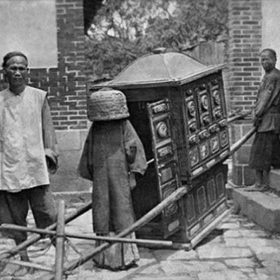
170708 – Canton – Guangzhou > words
North West of Hong Kong in the south of China where the Pearl River spreads its fingers into The South China sea lays a level land of canals, estuaries, deltas and silt banks. These rich soils connected by a labyrinth of waterways would eventually grow into the great trading port of Canton. Since the 16th century Canton had been connected to the west through trading with the British, French and Portuguese and in the process inheriting a tapestry of cross-cultural influences.
Sheltered and fed by the Baiyun mountains to the north, the Pearl River Delta is formed by the convergence of three major rivers, the Xi Jiang (West River), Bei Jiang (North River), and Dong Jiang (East River). The flat lands of these alluvial deltas are crisscrossed by a network of tributaries and distributaries forming a natural network of communication conducive to trade. Inevitably a people at one with the navigation of these terrains thrived, a boat people that were as happy on land as they were on water. To live, work, eat, sleep, sail and sell, a composite synergy of activities on one floating platform. Floating villages formed, together moored to the banks of trading towns. The transition from land to floating communities lost within the density of it all.
These romanticized images perhaps could only be formed from a European perspective, where history and culture are so intrinsically intertwined they are read as one without differentiation. Canton, now Guangzhou is today an economic powerhouse, much of its former history has been erased, first by the Communist Party and of late by the onslaught of Capitalism. The Guangzhou International Finance Centre, an exquisite 21st century tower at the heart of a thriving metropolis could not be further removed from trading dry fish under a bamboo canopy off the deck of a sampan. Yet each generation stands on the shoulders of those that preceded it, upon the accomplishments of others, knowledge is passed down reappraised and assimilated.
I am soon off to Guangzhou, perhaps to collaborate with a truly 21st century company with an expanding commercial empire, a logistics machine that opens a new shop every four days, an impressive trajectory even in these heady days of online globalization. But when in Guangzhou as I walk among its four lane highways, dwarfed by its 400m towers and lost within its multi million population I will be searching for the scent of Canton, searching as only a romantic can for the essence of what makes something unique. Only by identifying the ‘what and why’ that makes a product special can one hope to enthuse others to enjoy and share in that same experience. My romantic walk may well be just a day dream on the plane as the reality of the 21st century dynamism of this Chinese economic hub will hit next week and my schedule leaves little time to muse a thousand years of history. Idealised and naively romantic this may be, but to extract the essence of what is Chinese is the objective of my visit. Only by selling what is Chinese to the West will a Chinese company be successful, neither undercutting nor imitation will have longevity in a crowded market. So somewhere under the layers of what now is the metropolis of Guangzhou the cultural riches of a hidden Canton are waiting to be rediscovered.
The Surrogate Twin
Images left to right, 1 Canton River, 2 Canton Style, 3 Flower Boats, 4-6 Busy Waterways, 8 A Wedding Bride.
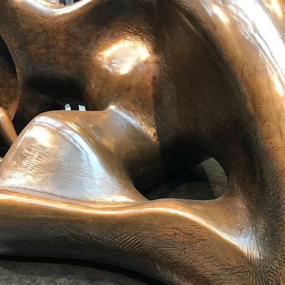
210217 – Burberry – London > words
Burberry a PLC since 2002, has been on a remarketing and growth trend for the last decade. The brand had suffered as counterfeits flooded the market and its signature check became synonymous with the wide boy and football hooligan. In 2006 Angela Ahrendts was appointed as CEO and in 2009 Christopher Bailey became Chief Creative Officer, together they focused on losing the hooligan association, instigating online sales and diversifying the product range. To implement this, emphasis on the signature check brand was reduced to less than 10% of its product range. Simultaneously legal actions were enforced against the counterfeiters protecting Burberrys IP. In 2006 a Spanish franchise was bought out and the group began online market expansion. The next seven years saw sales increase threefold helped greatly by increased revenues from the Asian markets. Angela Ahrendts left to join Apple in 2013 and in 2014 Christopher Bailey took the joint role of CEO and CCO.
Fashion in a commercial machine like this is not an art, its about professional packaging and its difficult not to be cynical when a large corporate tries so hard to tick all the right boxes. With its social media presence created through the support of up and coming musicians and its art referencing that is really art backdrop. Commercial packaging is about associative context and through this associative context one directs. Fashion buyers are a fickle crowd and have no concerns for deeper conceptual meaning and fashion is not the medium for this. A large corporate PLC is judged by the measure that all PLCs are judged, growth and profit and on this Burberry has been a national success story.
Post war art was left traumatized; it saw the wars as a sad scientific conclusion to the Enlightenment, where technology tears mankind apart. Arts reaction was to return to the primitive, with African, Polynesian and Inca art being the inspiration. The dreamscapes of Freud and the Surrealists fueled a sensual escapist art devoid of the holocaust of the recent social/political context. The late works of Matisse, Corbusier, Picasso, Hepworth and Moore all fall within the category of the primitive sensual. As Henry Moore left Hampstead for Hertfordshire, the solitude and peace of the English landscape would be a needed counterpoint to the gas poisoning he endured during WW1. A war in which he entered searching for the inner righteous hero and left only to despise Khaki and all it stood for.
The Henry Moore works alongside the Burberry SS17 collection at the Makers House offer sensual reprieve. The Burberry made-to-order capes inspired by the works of Moore need a further filter to elude to the Freudian dreamscapes. Luckily this filter was provided via a phantom silhouette that turned the capes into soft Rorschach images suitable for interpretations, where the dream cape ventures into the world of the dreamscape.
For Rorschach see text 250216.
Images left to right. 1 Henry Moore detail. 2-7 Burberry, Capes through a screen.
The Surrogate Twin
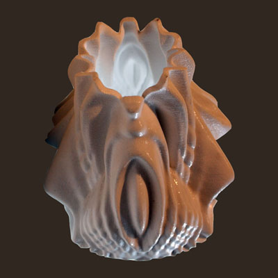
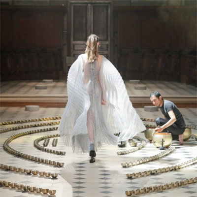
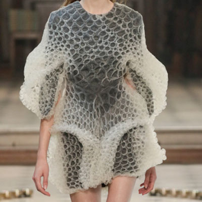
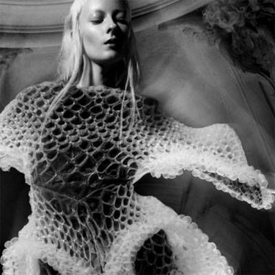
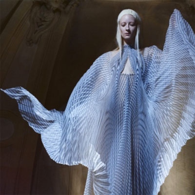
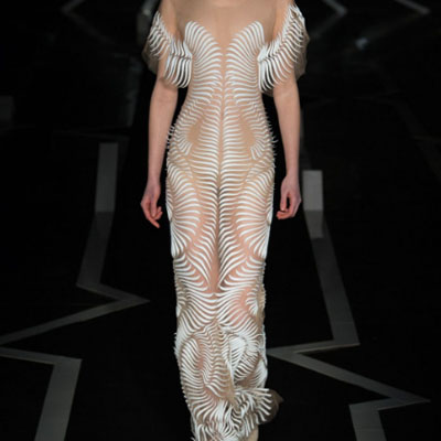
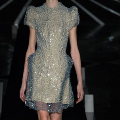
270117 – Iris Van Herpen – London > words
The Iris Van Herpen clothes not only continue to be at the forefront of invention and innovation but also are becoming more and more wearable with each collection. The AW16 collection Seijaku is an exploration into Cymatics. Sound waves are visualised using evolving geometric patterns, where the higher frequency sound waves produce a more complex pattern. The ethereal moiré effect of the dresses appears to be created by waves of light captured on sheer organza and tulle. As the models move a mesmerising optical mirage flows over the silhouette of their bodies. Like all Van Herpen shows nothing is left to chance. The Zen bowl sound installation of Kauya Nagaya, laid like ripples, flow from the footsteps of the models The sound fills the L’Oratoire du Louvre with a haunting resonance reverberating from the marble floor to the cross vault stone domes above. Dark oak panelling forms the backdrop at ground level. These earthy natural colours in a hall of haunting sound has a religious intensity used here to showcase and counterpoint scientific and technological pieces. The models are delicate, fragile, almost see through, each one a sculpture in motion ending their walk on a small granite plinth. The models here, as if intoxicated by the moment, display a doll like process of self-discovery. Every part of this show is perfect installation art, scripted polished and professional.
The SS17 collection ‘Between The Lines’ explores more optical illusionistic effects and distortions with rhythmic black on white 3D printed patterns sewn onto Mylar. The bodies form is lost within a camouflaged optic of complex geometries that create strange over body forms. Many of the pieces are not worn but instead walked within, the penumbra and the silhouette being recurring themes within the work. Iris Van Herpen and her very talented team are fast becoming the rising stars of the fashion world with work that continues to grow in strength and maturity. Her shows have become art works in their own right following on from the pioneering shows of Alexander McQueen in the early 2000s. This is brilliantly inspirational work.
Images left to right. 1 Cymatic volume Ben Lloyd Goldstein. Iris Van Herpen AW16 2-5, SS17 6-7.
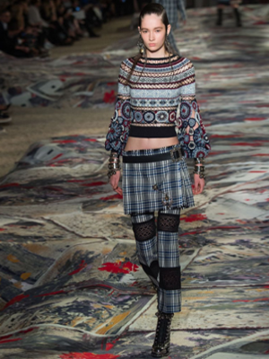
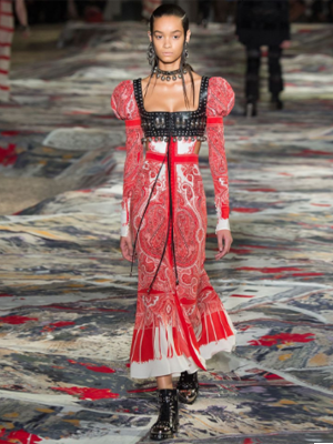
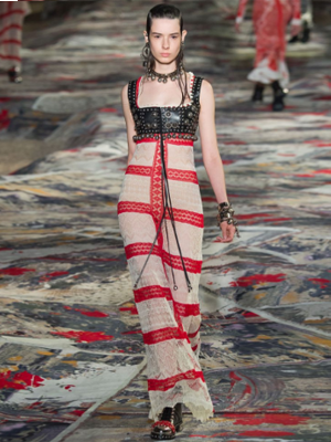
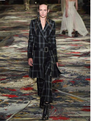
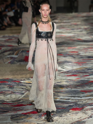
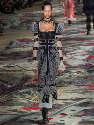
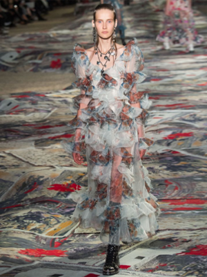
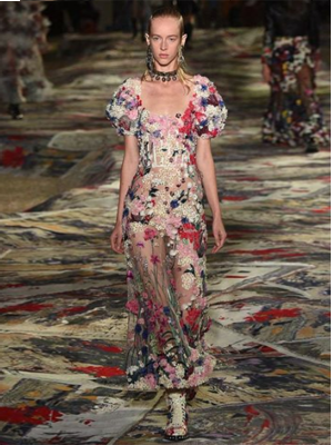
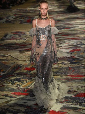
031016 – Alexander McQueen SS17 – Paris > words
Sarah Burton and her team at Alexander McQueen continue to go from strength to strength endlessly producing edgy, chic, sophisticated and romantic looks seamlessly blended into each collection. The SS17 Paris show was a wonderfully English assemblage with clear referencing to well-known icons of the industry, as well as promoting craft as Shetland lace meets Savile Row. The level of finish and refinement pushes historical and street referencing to new levels of sophistication. The image conceived is 21st century masculine and yet it is constructed in feminine leather and lace. Here the bralet is lifted from undergarment to the status of body armour. Consistencies across all of the recent collections demonstrate controlled directorship, well-edited and intelligent pieces and continued increasing professionalism. Edgy and sophisticated is a combination few can deliver.
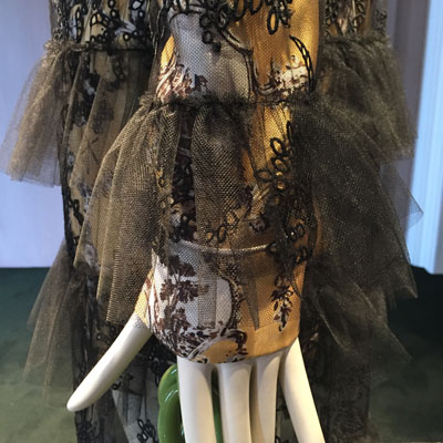
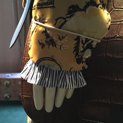
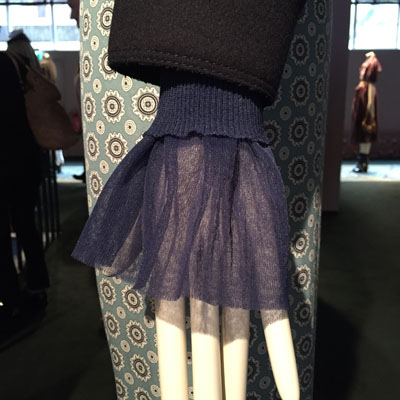
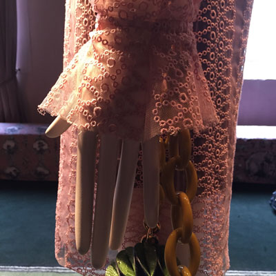
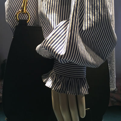
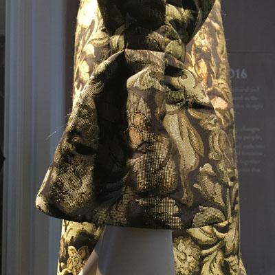
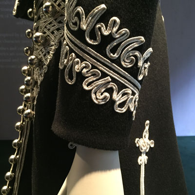
270916 - Burberry - Makers House, London > words
Garden, café, craftsman and the SS17 Collection drew crowds and queues to Makers House in Soho, where Burberry held forth for 1 week after 9 months preparation. Busts and sculptures taken from the Campaign shoot in the Walker Gallery, Liverpool sat among greenery and plants conjuring thoughts of Capability Brown gardens of the English County House.
From the collection my focus was cuffs, the juxtaposition of fabrics, patterns and shapes.
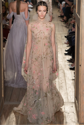
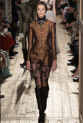
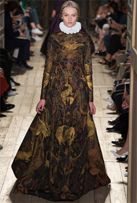
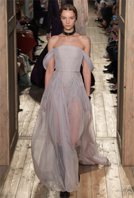
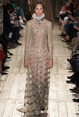
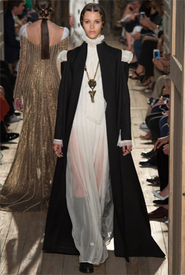
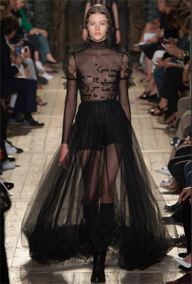
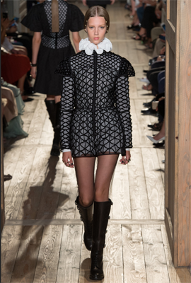
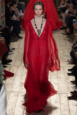
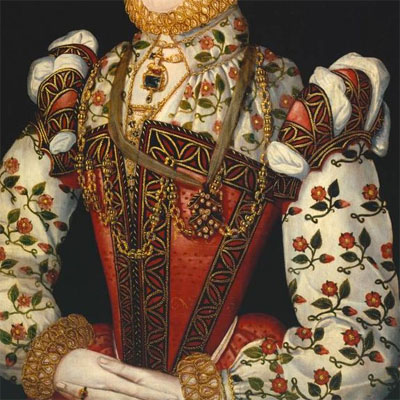
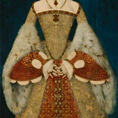
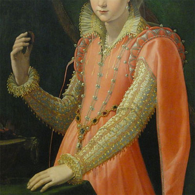
060716 – Valentino Elizabethan – Paris > words
Original Elizabethan clothes were heavy and stiff, they had two primary functions that of representing status and that of keeping warm. Layer upon layer were built up to keep out the English cold, with tapestried woollens over furs and cottons. Elizabethan clothes were often held together with lace or pins as buttons were mainly decorative. Tight fitting corsets made waists look as thin as possible and hips and shoulders were exaggerated in a form of power dressing. Intricate detail and needlework especially on the doublet, sleeves and collars was the norm. Satins, silks and velvets in gold, purple and crimson were also desirable among the Tudor elite. These were colours that ordinary people were not allowed to wear. Clothes had hierarchy and rank by order of law. (See Diary 160814 – Cut and Fold)
Due to the 400th year anniversary of Shakespeare’s death, Shakespeare has been a theme of many exhibitions and installations so far this year but none come close to the mastery of Valentino’s Elizabethan collection for Fall 2016 Couture. The language of ruffs, doublets, bodices, clerical robes and puffed sleeves has been given a soft, sheer 21st century interpretation by Pierpaolo Piccioli and Maria Grazia Chiuri. It is very difficult to reinterpret historical clothing made with a different purpose, material and function all of which are now so alien to the 21st century. However, the intricacies of Elizabethan detail work fits comfortably in the world of today’s couture. The soft ruffs, the sheer materials overlaid with intricate embroidery brought a new sexuality to the interpretation. Bare arms with light lace cuffs were particularly soft and feminine. The formal clerical robe with cut away shoulders, juxtaposed with lace and transparency allowing enough sensuality to enhance the female body with power and confidence. Elizabethan inspired men’s slit breeches here make a boyish figure. It was disappointing that there was not a reinterpretation of the cod-piece for 21st century woman, probably to political.
The Shakespeare quote woven into a lace blouse.
“Love me or hate me
both are in my favour.
If you love me,
I'll always be in your heart,
but if you hate me,
I'll always be in your mind.”
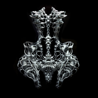
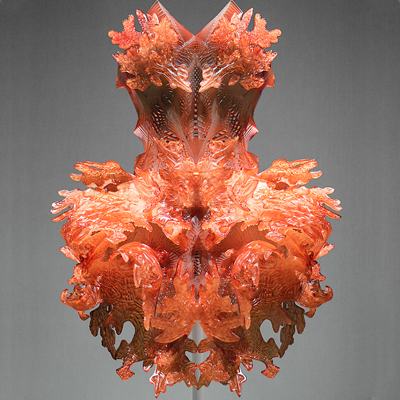
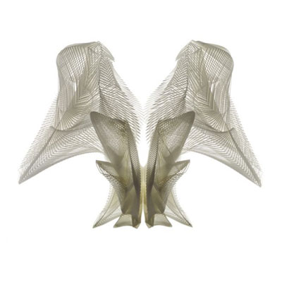
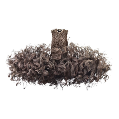
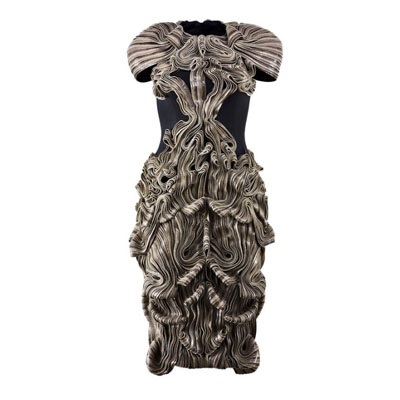
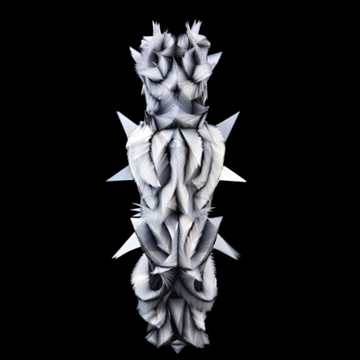
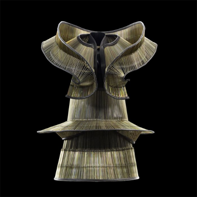
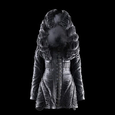
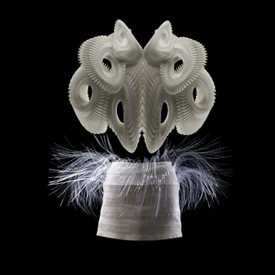
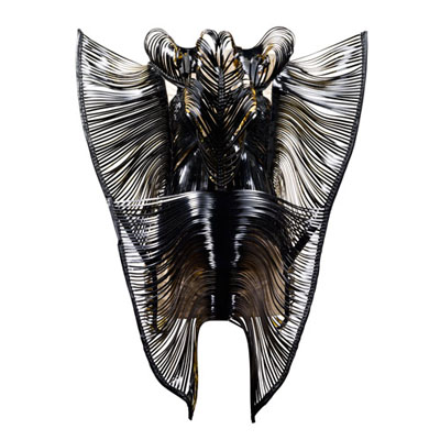
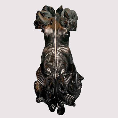
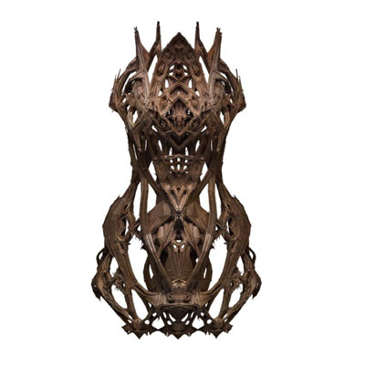
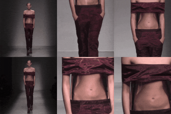
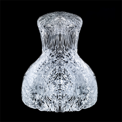
270616 – IVH Future Couture – London > words
On the shelves in the studio is a book from 1992 Evolutionary Art and Computers by Stephen Todd and William Latham, a mathematician (Todd) and an artist combo. In this book now nearly a quarter of a century old lies an outline for the spatial form making of the art schools for the next few decades. The art is generated by simplistic rules typically scale change / rotate / move on xy or z axis – repeat. This basic algorithm generates spiraling patterns similar to fractal geometries. Minor alterations to the percentage of any of the three above radically alters the final form and the permutations are infinite. Add duplicate / mirror image and a 3d printer and you have the formula used to generate much of the work produced by architectural and industrial design courses over the last two decades. The formulas are perfect for work that is excreted. Over the past decade the work and research in this field has increased in refinement and sophistication. Algorithms sit on or inside algorithms so lacework can be integrated onto forms as part of the generative process. Colour and medium change can also be integrated into this seamless process. As the algorithmic input is infinitesimal so are the concluding forms. The artist/designers role is that of director/editor with the decision making process usually led by subjective aesthetic criteria. The next game change will come from AI’s contribution where performance criteria can be entered into the development process perhaps one day generating real time responsive form. As these ideas leave the research labs of the universities it has been adopted by industry and used in a range of unexpected ingenious and explorative ways.
Iris van Herpen works with Couture that is both futuristic and sculptural, mixing traditional hands on Couture techniques with 3D printing and laser cutting. With collection concepts such as Hacking Infinity, Biopiracy, Hybrid Holism, Synesthesia it is clear that the intellect drives the work and the craft delivers the product. The clothes are structured to hold volume and form and movement is very much part of the sculptural choreography. The work is some of the most beautiful conclusions to the application of the above paragraph and as such is a logical progression to this area of exploration. Van Herpen’s studio has had a prolific decade and the exploration continues to gain pace and the coming show will be watched closely. Below are the beginnings of new concepts being formulated by this exploration and these are of intellectual interest beyond the aesthetic.
1 Scale. Algorithmic generated form is scaleless. Whether it be a Zaha Hadid building or a Van Herpen dress. One could shrink Zaha’s Al Wakrah stadium and wear it or increase a Van Herpen dress from the Lucid collection and inhabit it.
2 Surface. Many of the pieces in Van Herpen’s work occupy a space beyond the body and as such form a penumbra in which a silhouette is cocooned. I would predict that this outer penumbra will soon be the intelligent surface of most buildings, just as animals have fur and trees leaves.
3 Movement. Movement has always existed in fashion but here something different happens. Sometimes the piece is a kinetic dress that amplifies the movements of the wearer but when there is a dislocation between the silhouette and the penumbra there are two independent choreographies within each piece, one organic and sexual the other abstract and sculptural.
4 Distortion. The use of Optical Light Screens within the garments distort both form and body.
5 Responsive. Sensory fabrics, fibre optic, sound emitting, have been woven into garments that encourage tactile and soon virtual interaction. Our technology, always a prosthetic extension of ourselves, gains a new intricacy and intimacy. Perhaps our garments will soon be knowledge intensive, self growing and self repairing.
Related exhibition Manus x Machina The Met Fifth Avenue New York through to 140816.
The Surrogate Twin
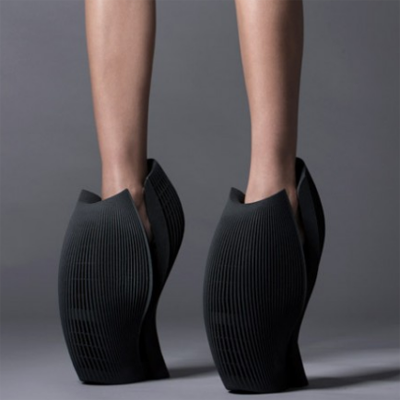
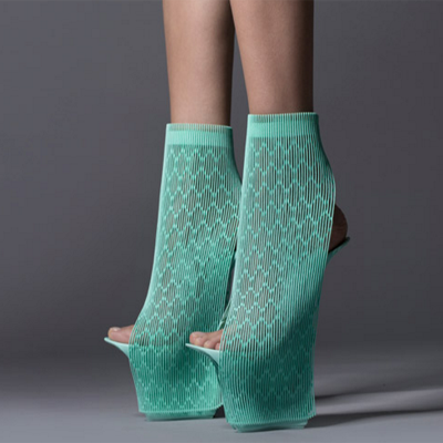
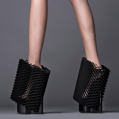
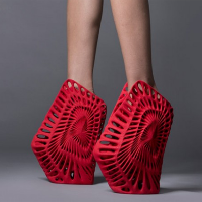
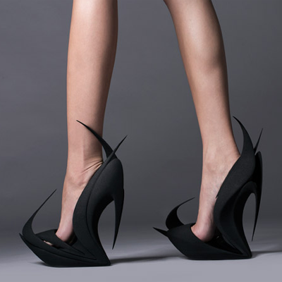
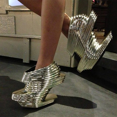
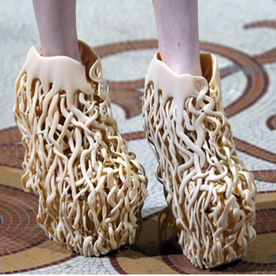
240616 – 3D Printed Shoes – London > words
In the last decade computers working with 3D printers have become the front line of design and innovation in which fashion has been no exception. Computers create and visualise the previously unimaginable completing three-dimensional compositions of such complexity that they would have formally been impossible to either draw or craft. This new 3D medium is forcing exciting cross discipline collaborations as designers, architects and computer artists work together to explore the new spatial possibilities. The shoe and the bag are strange fashion accessories but the way they hold volume and space may be the architects attraction. As all architects must design a chair the shoe is becoming the fashion equivalent of the must do project or collaboration project. As can be seen by the work above the results have all been positive pushing limits in new aesthetic directions and forms.
Images from left to right – Ben Van Berkel, Ross Lovegrove, Michael Young, Fernando Romero, Zaha Hadid x2, Iris Van Herpen.
The Surrogate Twin
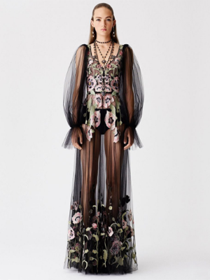
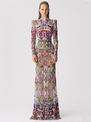
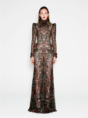
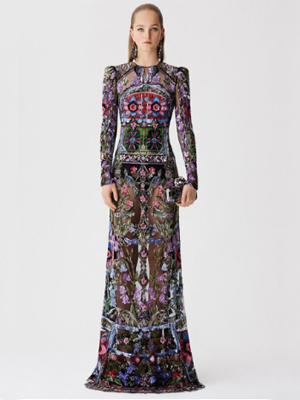
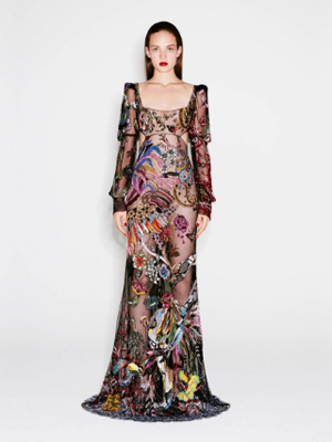
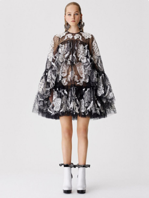
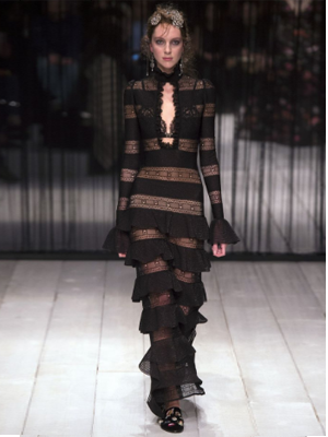
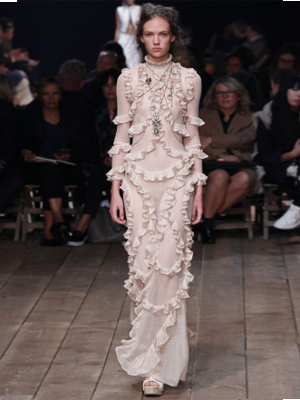
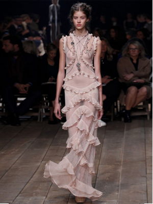
220616 – Alexander McQueen – SS17 New York > words
The Alexander McQueen collections from SS16 to SS17 have taken on a new femininity. With dresses that have intricate embellishment that overlays lace and organza creating long flowing lines that glide and float. Ghostly penumbras support their own portable imaginary floral fields, summer fields to walk through or bath in. The Pre Raphaelites were not the source of inspiration for these collections but as numerous Ophelia’s grace the catwalk silhouettes enshrined by nature’s beauty it is difficult not to have John Everett Mills painting in the back of ones mind.
The Alexander McQueen team go from strength to strength.
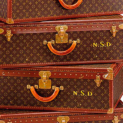
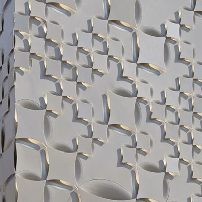
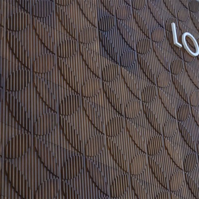
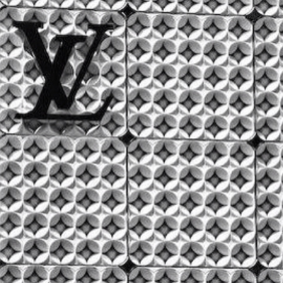
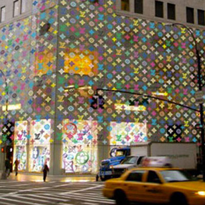
210616 – Louis Vuitton – V&A London SW7 > words
Of late I seem to spend all day everyday reviewing the problems of the world investing on some forth coming resolution and losing all my capital from my belief and error. The papers are full of terrorism, pollution, population, climate change, nationalism, amoebic economics, weak politicians, corruption and incompetence. It has been a struggle to remain optimistic when the planet that holds seven billion can only sustainably support two billion, and we waste time and energy with naive populist protectionism.
The Louis Vuitton lecture was so refreshing as none of the above was mentioned once and although I could be accused of congratulating fiddling Nero the short reprieve was a holiday in paradise. At Louis Vuitton the architects and designers simply get on and do what they do best, making exquisitely beautiful buildings and objects. David McNulty is Director of Architecture at Louis Vuitton and is responsible for 463 stores that require updating every six or seven years. The whole presentations focus was almost entirely on the translation of the LV valigia to a buildings skin. This focus continued from building to building and from country to country in an endless pursuit of reinterpretation and refinement. The building skin, a complex layering of elements that maintains thermal, acoustic, weathering, structural, light filtration characteristic along with thematic aesthetic manipulation. The presentation was a visual walk through projects rather than a technical and detailed appraisal of each façade and this was well paced for this presentation. Closer details, means of fabrication and materials used would be a welcome addition but have proved difficult to find.
The Surrogate Twin
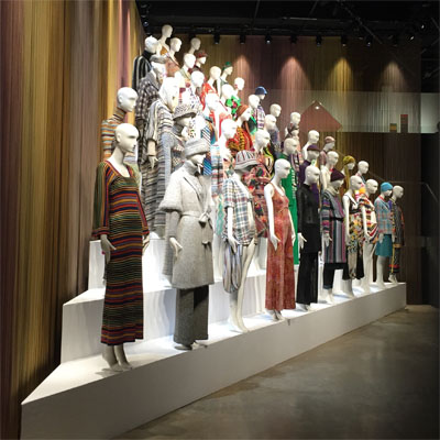
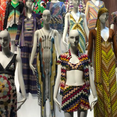
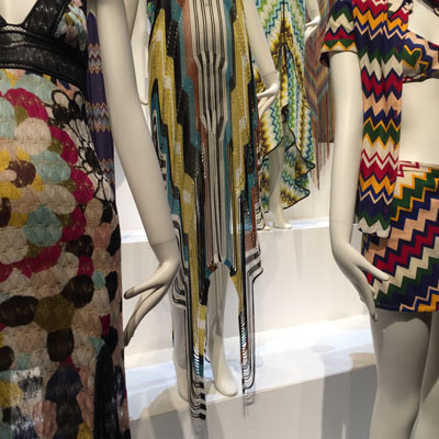
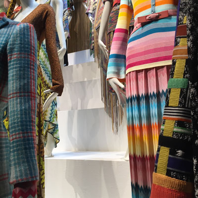

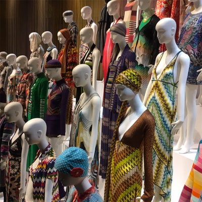
280516 – Missoni – Museum Of Fashion And Textiles, London SE1 > words
The Missoni exhibition at the Museum Of Fashion And Textiles is rooted in the 1970’s and in the Optical Art of the late 1960’s and early 1970’s. Colour, pattern, rhythm and technique are manipulated mathematically to form psychedelic patterns that tease and confuse the eye. Colours rarely, if ever, blend and instead are juxtaposed as balanced opposites that follow rules of sequence and collation. This is a small exhibition but the 1970’s focus gives it considerable punch. Clear referencing to Op Art, Ottavio and Rosita Missoni’s own colour studies and the whole predominant mood of peace, love, optimism and exploration of the early 1970’s can be felt in every room. For those interested in contemporary art history the exhibition is a beautifully nostalgic piece. For those interested in fabrication technique there are few more rigorous than Missoni.
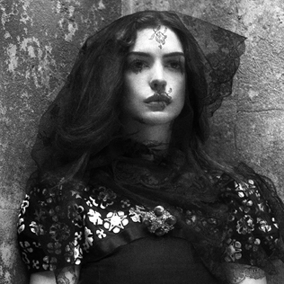

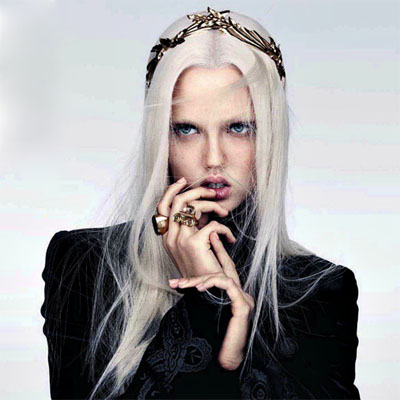

250516 – Gothic Beauty – London > words
In Waldemar Januszczak’s The Dark Ages he describes the art of the barbarians and list among them the Vikings, Vandels, Huns, Moors, Celts and Goths. Waldemar rightly argues that their art was beautiful and inspired. Our own contemporary subculture of Goths has also inspired many designers of Couture to produce an exquisite dark beauty.
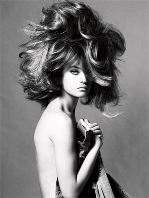
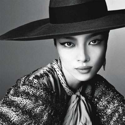
110516 - Steven Meisel - London > words
Genius beauty - "as it needs no explanation"
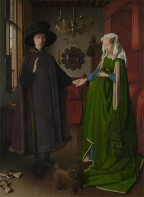
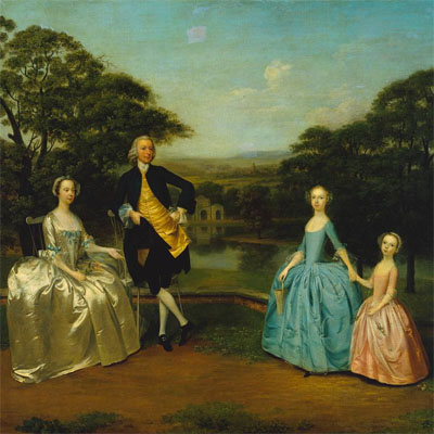
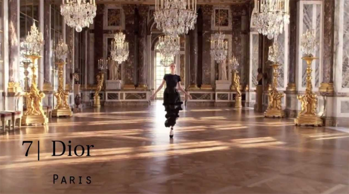

090516 – Glamour – London > words
Oil painting celebrated private property. Ownership is measured in quantity and quality, vast landscapes of the country estate, elegant details of the jewellery collection, exquisite fabrics, rare porcelain and sculpture. The quality aspect of ownership puts emphasis on fine detail and from this the hyperreal super intense assemblage develops as a genre in which to indulge in excess. The viewer is to envy the excess as they are excluded from it. The digitally manipulated image continues this collation of detailed and elegant excess and uses it to advertise a lifestyle via desirables. The advertisement encourages envy but simultaneously offers hope as it sells the idea that lifestyle can be purchased through products. Lifestyle is sold on association so new products are juxtaposed against established lifestyle criteria. The hyper-real is tactile and touchable, being within reach is part of its selling power. The advert differs from the oil painting in one very important aspect. The oil painting reaffirms ownership; it is a picture of products, property, landscape already owned, an authentication of status. The advert promises a lifestyle if one could own. The advert has to first make the viewer dissatisfied with their existing lifestyle to encourage them to buy into the lifestyle promised. Adverts play on the anxiety that if you have nothing you will be nothing. The oil painting was a summation of wealth at a particular time and was therefore painted in the present tense as a record to be handed down to the next generation. The advert is always in the future tense, what could happen if you bought into the proposed lifestyle. Most people can rarely afford the whole lifestyle so they buy a symbol of it, the designer t-shirt or the signature sunglasses. Advertising aimed at the middle class does so by selling lifestyle combinations, complete outfits or complete interiors.
Glamour is a twentieth century invention and presents the enviable. To be enviable it has to be achievable and within reach. True beauty, genius and supreme talent are not envied as we appreciate their rarity and their genetic good fortune. These are not glamour. Glamour is envy added to the everyday.
Glamour’s true potency begins with the cinema of the 1930’s and is a twentieth century marketing invention. The exponential potential of dispersing media with the invention of film and television puts emphasis on the visual above all other characteristics. Glamour capitalises on the distribution and manipulation of the visual. The digitally enhanced image becomes the symbol and identity of the person. The person is assessed completely through the visual image. Markets are saturated by recurring images and these substantiate the ideas of glamour. The concept of glamour is most tenacious in urban conglomerations, in large cities, such as Paris, Rome, London and Los Angeles. Previously here the glamorous image could be quickly distributed. Today the concept of city has little relevance as glamour is propagated globally online. Glamour is international and tied to modern economies. It is a sellable commodity. As advertising develops, the visual image is increasingly used to provoke yearning for a lifestyle. As glamour is always advertised in the future tense, achievable through purchase, it is insatiable and enduring. Modern man exists within the contradiction of what he/she is and what he/she aspires to be. Advertising and glamour exploit this contradiction and this life of envy. Advertising gains credibility and longevity by bringing the unobtainable within reach only to offer the next desirable once reached.
Celebrity culture specialises in selling glamour, it packages the normal in a wrapper of envy. The viewer realises that the only difference between themselves and the glamorous is the wrapper. Today the glamorous are made over night they need no special talent other than being exposed to an audience. Reality programmes have taken the most banal and repackaged their product as celebrities. Marketing loves the celebrity, as they are able to capture a wide audience through a single character. The increased normality of the celebrity the greater the catchment potential for the marketing teams. Not too pretty, not too bright, not too talented the girl and boy next door all wrapped in glamour selling envy and desirability. As the marketing of glamour captures a forever widening audience with new mediums of distribution the subject of glamour reaches a new low. The greater the market-reach the lower the common denominator needed of the subject. Maximising market catchment becomes the driving force behind glamour. Glamour is an illusion. Glamour keeps the viewer at a distance and it needs that distance to maintain the illusion, this is why glamour works so well when distributed via the media.
Glamour may have peaked during the 1950s and 1960s. At this time glamour and style were intrinsically linked and the marketing of it was personalised and limited enough to retain its credibility. Glamour today is mass produced, a factory product, a process through which each new prospective celebrity is churned. It uses a generic formula for what is glamorous and applies this to each individual, saturating the identity and qualities of the individual. Numerous talent shows have the ability to turn raw talent into tacky mediocrity via the glamour machine producing a poor derivative of the celebrity juror. The celebrity juror is often already a second or third generation derivative and this process is dilutive.
Glamour fortunately does still exist where the individual is in full control of the marketing machine. Glamour provides the platform for experiments in excess, where designers can explore the limits of luxury and the conventions of etiquette. The recurring red carpet events of the Twentieth and Twenty-First Century have become the substitute platform for The Royal Courts of the Seventeenth and Eighteenth Centuries and as such glamour has replaced pageantry.
The Surrogate Twin

260416 – Punk Sexuality – London > words
The UK of the 1970s was a complete mess. The working class, as always, react to oppression with invention. Cohesive society fractures and splinter groups form to establish areas of new art, identity and exploration. Some of these groups were retro and some new, some are positive and some negative. Skinheads, Teds, Rockabilly, Ska and Punks were all on the streets during this period. They had their own clubs, music and style of dress. At the time all of these may have seemed negative or without direction but with hindsight many positive things came out of this period of unrest. None was more positive than the achievements and legacy of female punks and this continues to enable and influence future generations. The punk movement encouraged complete self expression, neither talent nor tuition was a prerequisite and everybody was equal. This formed an unlikely platform for women, it was explorative, liberating and wild. The Roxy of the late 1970’s was a male dominated venue, it was aggressive, dangerous and intimidating and yet there were women there holding their own. I was in my mid teens when at the Roxy I recall how disturbed and confused I was about punk women. I found punk women incredibly attractive I had a primal lust for them but they terrified me. All of the signals were confused, public/private, inviting/defensive, attractive/repulsive, welcoming/opposing, aggressive/friendly male/female all of this in the chaotic cocktail of sweat and energy that was the Roxy set off sensory alerts that kept you on edge. It was an adrenaline junkies heaven. Punk women were aware of this male disorientation to their aggressive androgyny and explored its limits. It was, of course anarchic, it destabilised and confused, it was living performance art reassessing all conventional relationships. I can remember reading many years later a quote from Viv Albertine of The Slits “Guys didn’t know whether to fuck us or kill us” and although I’ve never wanted to kill anyone I knew exactly what she meant.
The counter culture of the punk scene encouraged women to participate on equal terms. If you could play get on stage. If the crowd approved they would dive into that bouncing scrum called a dance floor and you could continue playing. If the crowd disapproved they’d throw things at you until you left the stage, the same counteraction whether male or female. Punk enabled more women to form bands, play instruments and tour independently than in any previous music scene. Women pre-punk were often kept on the sidelines or added to a band for decorative affect. Previously there were many women front singers but now there were whole bands. The influence has continued as it is no longer unusual to see female guitarists or drummers. The role and the attitudes of Metal group L7 are indistinguishable from male Metal bands and this gender liberation owes a lot to the women of Punk.
For Punk the body was a political instrument, a symbol of opposition, of statement, of disgust for established conventions. It made the viewer question their own ideals on what is acceptable and gender presentation and identity featured strongly in this. Men dressed as women and women as men. Gender specific garments were adopted by the opposite sex. Hair, make up, piercing was all part of a genderless uniform. The conventional hierarchy and ordering of clothes was also questioned, everything that was normally hidden was brought to the front creating explicitly outward identities of sexuality. Further dress hierarchy was destructured as skirts were worn as tops, shirts worn back to front, clothes worn inside out. There was ripped multi layering, material and colour clashes, country tweeds with torn tights, suit jackets with metal studs and chains. Slogans adorned most surfaces and were no longer confined to T-shirts. The only rules were there were no rules. The body politic juxtaposed items of conventional clothing as a critique of their established roles and their use in society. Punk was an angry movement expressed through a masculine aggression. Women adopted an aesthetic of masculine aggression but pushed this further by using their bodies in the same way that men would. At the time Punk was not a deliberate intellectual movement but intuitive and responsive. In retrospect Punk was very much part of the Post Modern schism, a point of inflexion, questioning and redirection.
The influence of punk endures. Ten years after the Roxy I remember seeing a student at an art college, she was dressed in an orange Gaultier top, It had arms down to her knees and her arms came out at the elbows. The top was spray fit. She had a pair of Wolford electric blue tights on and had black steel toed hobnail boots, unlaced. On other days she would come to college in stripy pyjamas or an old ripped boiler suit that had no sides, you could see straight through from one side to the other and she rarely had much on underneath. When she left she would wrap up in a moth eaten fur coat, more living compost than garment. It was easy to read the legacy of punk simply from her outfits. Design houses had favoured it from Gallilano to Gaultier and quickly explored the new freedoms of aesthetic. Chanel was using graffiti?? Designer fashion pieces were now being mixed with found and altered items trawled from the second hand charity shops. Women were still questioning the conventions of beauty and appropriateness and aggressively staking their space. They would argue their case with a blind vengeance and defend their work until the critics became overwhelmed or defeated. The student in question was Lorraine but it could well have been many an art student of the 1980s of 90s. Once again I was overwhelmed with the irrationality of it all but reassured by the undiscovered potentials expressed though the medium of continued conversation that is progress.
The Surrogate Twin