150616 – Switch House – Tate Modern, London SE1 > words
Joining the endless queue of Tate members for the preview of the new Switch House building by Herzog De Meuron I was aware that any kind of appraisal would be difficult. The galleries were rammed shoulder to shoulder with eager viewers crawling over each other to see the unseeable. From this position we produced our first opinion of the new galleries so with time this may change. This is an intuitive and contrarian view.
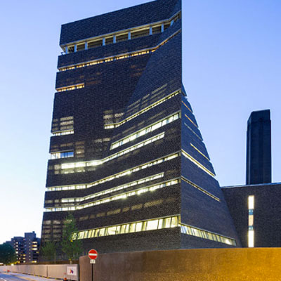
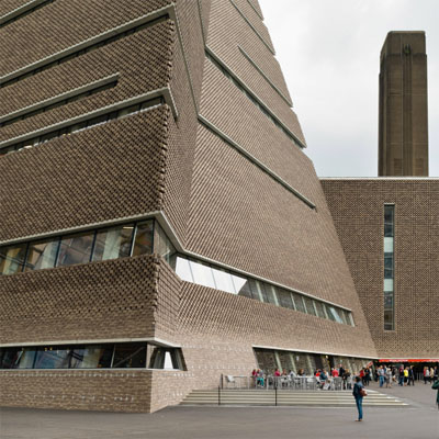
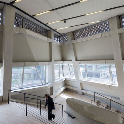
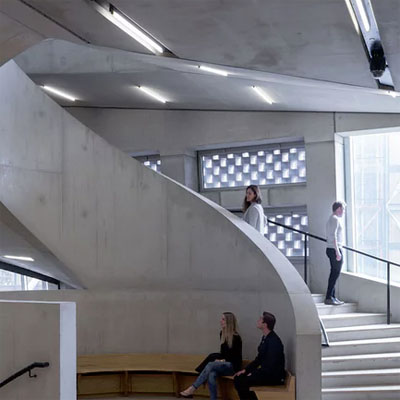
The Switch House has a strange initial feel, that of disjunction. The building has huge weight, a perverse introspection, a colossal structural cage combined with car park detailing. It doesn’t feel like a new build but instead like a conversion and a conversion with many twisted constraints. It is as if the architects first built a monument and were then forced to structure and inhabit it. It is like Gustave Eiffel’s Statue of Liberty where a smooth external skin hides a crude grid lattice of steelwork. One is aware that one is inside the other but the two never become a complementary totality. It is a film set in which architectural items may hang. In part this is driven by the lack of genius loci and is inevitable for a gallery that offers introspective spaces to view a collection of multi national decontextualized pieces.
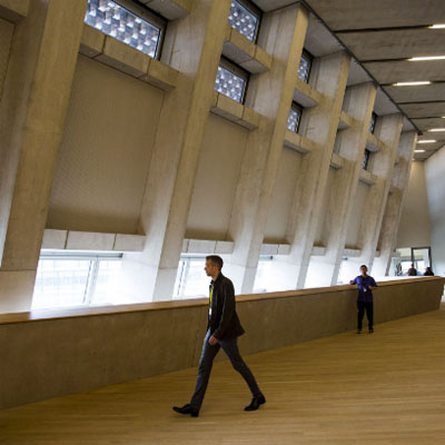
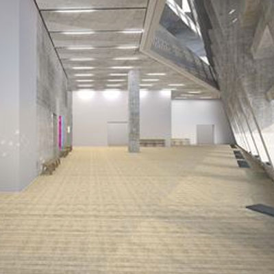
There is little precedent for tower galleries. Typologically galleries tend to be wide low buildings, of sequential spaces that maximise light from above. The idea of a tower gallery is intriguing as there is a need to be creative with natural light coming from the side. This would usually be the type of problem that architects enjoy but not here at Switch House where natural light is ignored. A suite of sequential spaces that are artificially lit can be anywhere, they could be underground so why put them around the perimeter of a tower with potentially incredible views of the river and city? Why put the service cores central to the plan and emphasise their importance as the expected route of circulation? Why even in the café space do we sit with our backs to the view? None of this made any sense……and I usually like Herzog and De Meuron buildings. So here is what should have happened.
The service cores should be moved off centre towards the north façade, towards the river. Between the service cores and the north façade should be a zone of circulation and meeting spaces with cafes and viewing platforms on route. To the south of the service cores would be the internal galleries lit both artificially and naturally from the side. The galleries would be punctuated discreetly with vista points. In a pyramidal form where the façade retreats as it climbs and open circulation space along the façade would open up equally to the sky and views enhancing the sequence of movement from gallery to circulation and back to gallery. In summation we would climb the river and sky to return to the gallery.
It seems counter productive to write a critique of a building by setting up an agenda for another but here Herzog and De Meuron have so missed the potential of this site that reviewing it in situ seems nonsensical. Perhaps I am looking for a national gallery building and this is an extension to an existing gallery? Perhaps with time I will be able to look at this for what it is but for now why is it as it is and what were they thinking? None of it made sense. Herzog talk to me?
The Surrogate Twin